
Skip to content
Selected work / ELAI Studio

ELAI.

Σχεδιασμός ετικετών για μια σειρά περιποίησης.
Καθαρή ταυτότητα. Ενιαία παρουσία.

LABEL DESIGN / PACKAGING APPLICATIONS
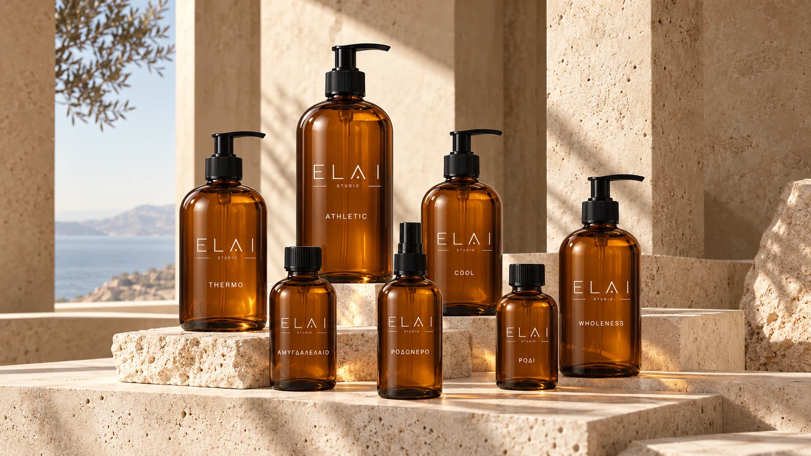
Ομαδικό mockup επτά προϊόντων ELAI Studio σε αρχιτεκτονικό σκηνικό από πέτρα
01 / THE COLLECTION
THE ELAI STUDIO SIGNATURE
Λογότυπο ELAI Studio

Η υπογραφή που συνδέει τη σειρά.

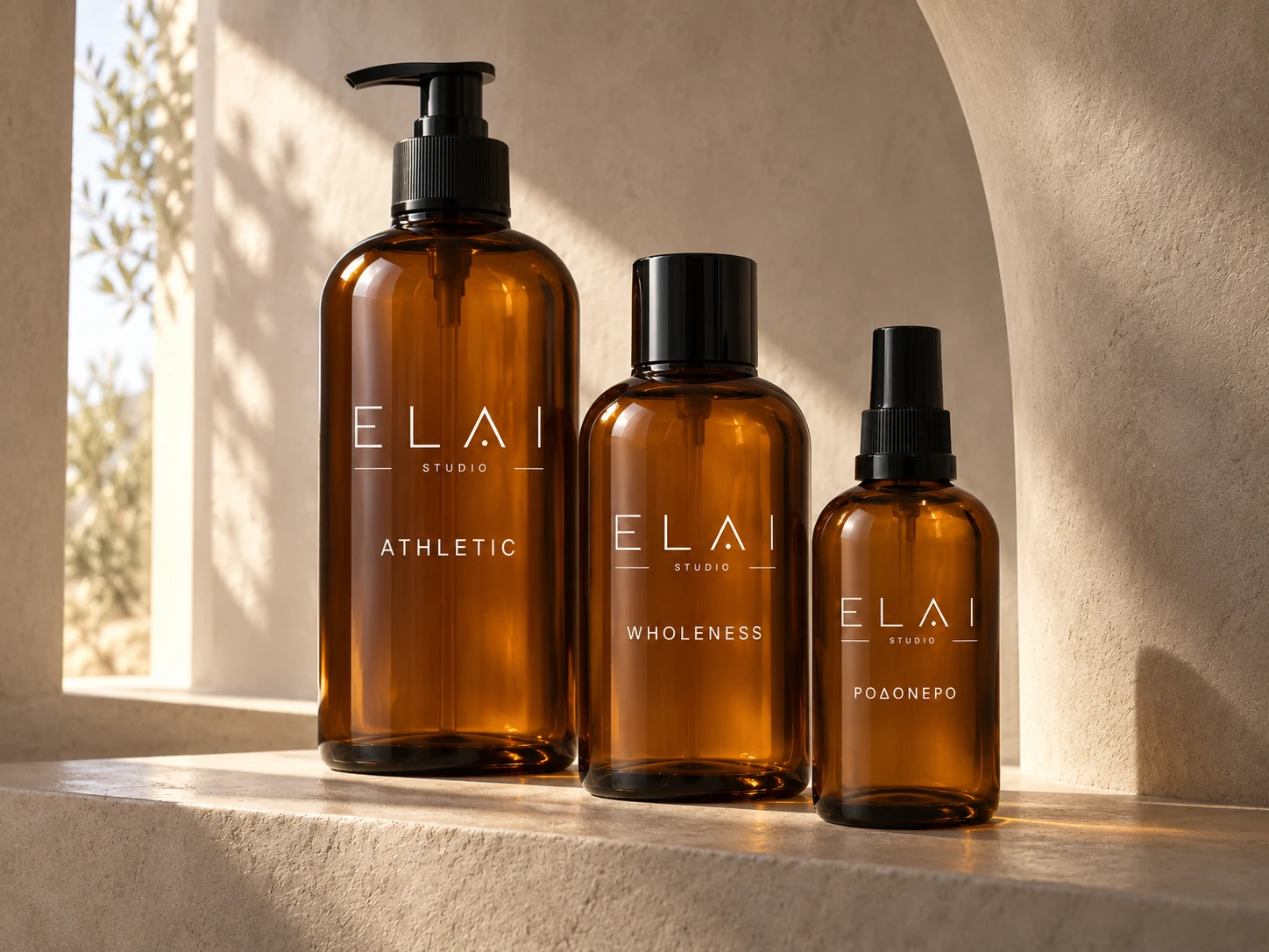
Κοντινό mockup τριών φιαλών ELAI με φυσικό φωτισμό
02 / BODY CARE
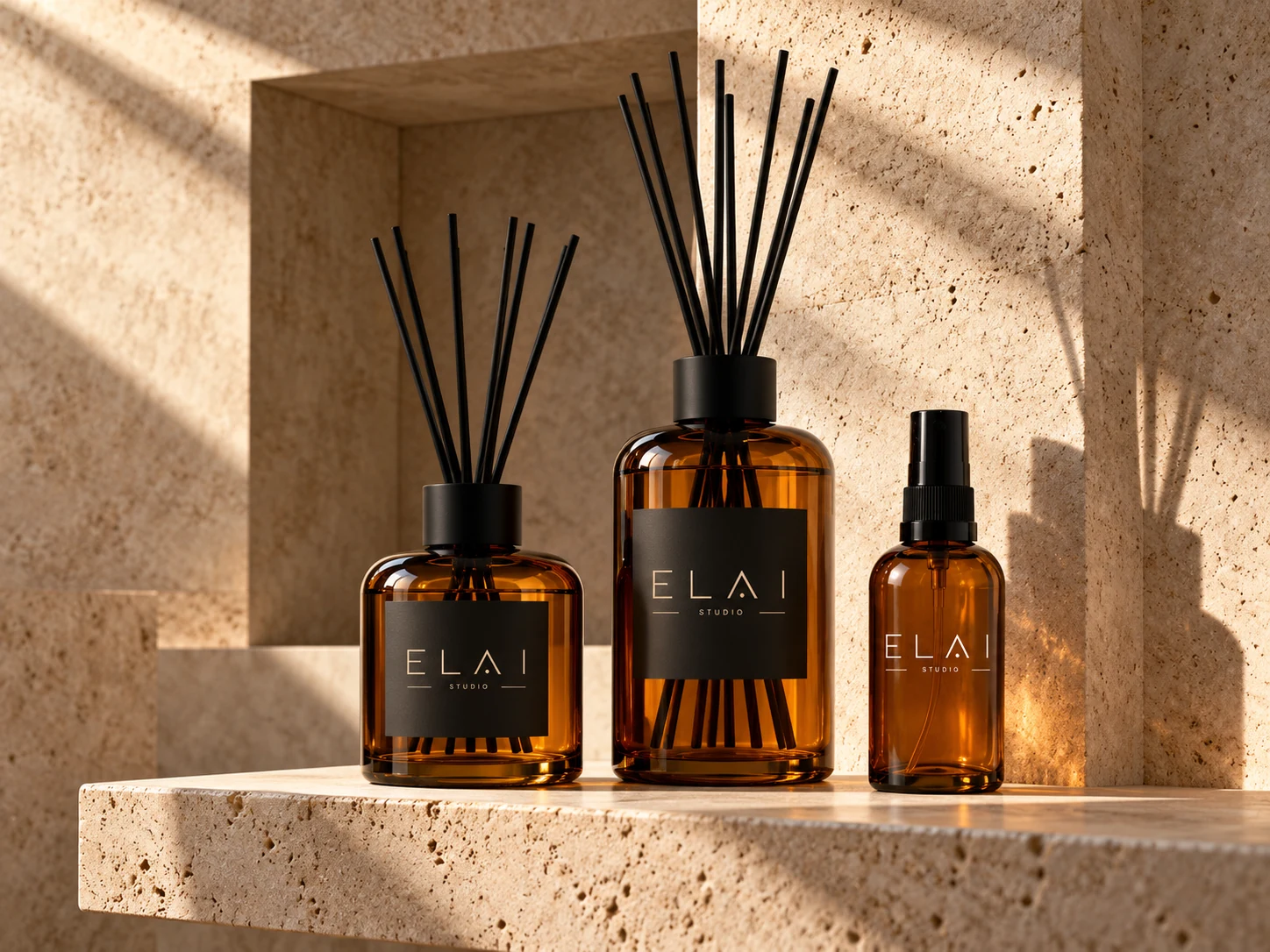
Ενδεικτικό mockup ELAI Studio diffuser με μαύρη ετικέτα και μπεζ λογότυπο
03 / HOME FRAGRANCE

Ενδεικτικά mockups με AI, σε αισθητική φωτορεαλιστικού 3D rendering. Οι φιάλες και οι αναλογίες αποτελούν απεικονίσεις παρουσίασης, όχι φωτογραφίες τελικής παραγωγής.

Your next project

Η επόμενη σειρά
μπορεί να είναι η δική σου.

Μίλησέ μου για το project σου ↗
Interactive art / Physical computingIndependent research · 2026

PROMPTLESS

Physical Interfaces for Human–AI Visual Co-Creation

What if you could touch AI instead of prompting it?

PROMPTLESS is an interactive media-art project in which knobs, buttons, switches and sensors shape an evolving visual system. Participants use touch, rhythm and continuous adjustment to influence what they see. The work explores the relationship between human intention, computational behaviour and AI-assisted visual material.
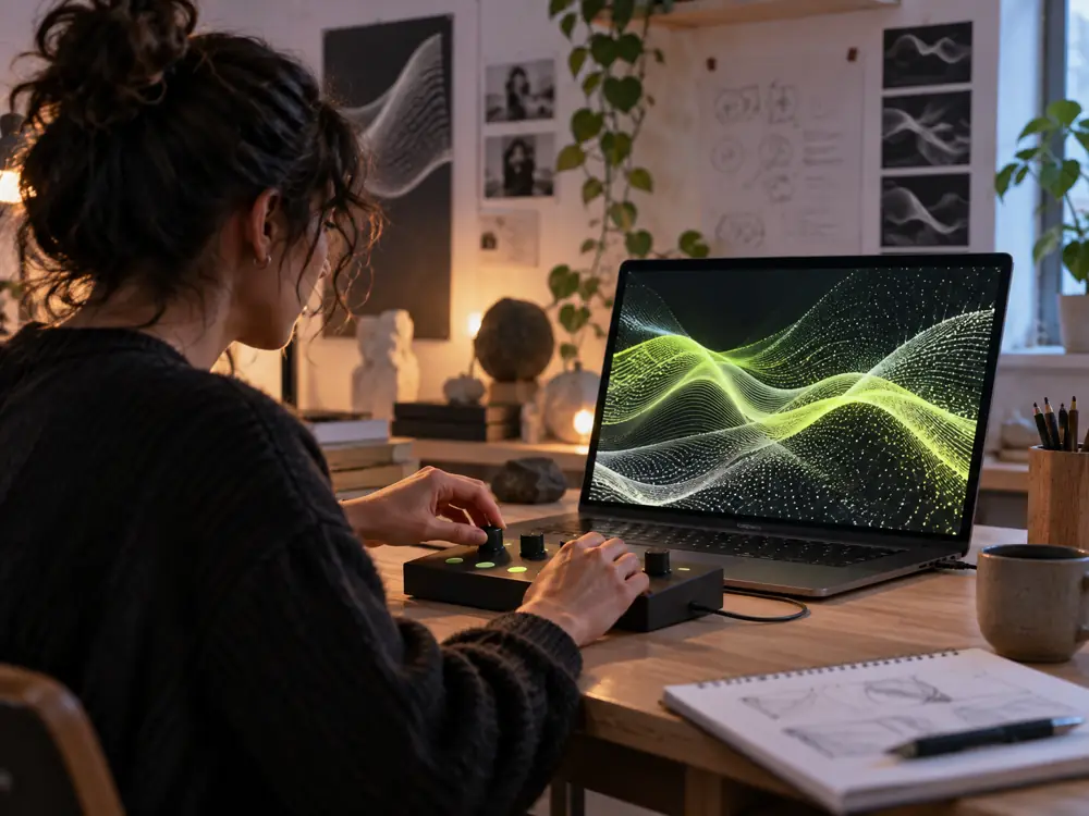
Illustrative concept of a participant using a tactile controller to shape a visual field on a screen
01 / Tactile interaction. AI-generated concept visual extracted from the project proposal.
01 / The proposed interaction

A physical action.
An immediate visual response.

Each movement changes a visible parameter: spatial arrangement, density, speed or distortion. Participants can explore the system through repeated gestures and observe how their decisions transform the visual field.

The proposed physical controller connects to a browser-based generative engine. Optional light or ambient-sound sensors can also bring the surrounding environment into the work.

AI-assisted material forms a separate visual layer. Its updates are handled independently of the continuous rendering, so model processing does not interrupt the immediate response to physical input.

  1. Touch

    Turn knobs, press buttons or change a switch on the physical controller.

  2. Translate

    An ESP32 or Arduino sends input over USB serial, mapping each gesture to a visual parameter.

  3. Respond

    The browser engine continuously changes the composition, movement and visual behaviour.

  4. Experience

    A screen or projection makes the response visible. The participant adjusts again, shaping the next state.

02 / A tactile visual language

Small adjustments.
Different possibilities.

The controller is intended to make the connection between action and outcome easy to explore. Its precise mappings and control ranges will be refined through prototype testing.

The research asks how embodied interaction changes a participant’s sense of agency, authorship and understanding of an AI-assisted creative process.

Intended control map
CompositionSpatial arrangement
ComplexityDensity and visual detail
MovementSpeed and rhythm
DistortionDeformation and variation
Human / AIBalance with AI-assisted material
03 / Shared exploration
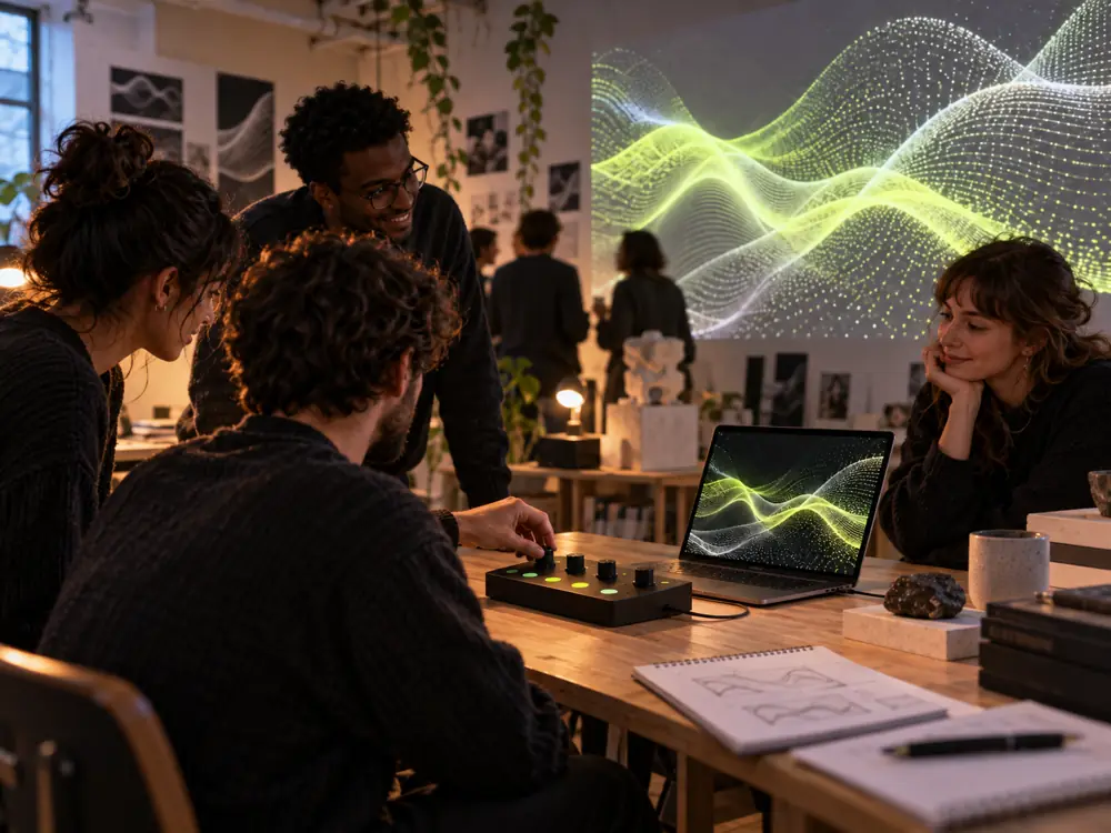
Illustrative concept of a small group testing the tactile interface with a projected visual field
02 / Community testing. AI-generated concept visual extracted from the project proposal.

The audience becomes
part of the research.

The project is designed to develop through open studio sessions, hands-on exchanges and public testing. Participants can try the interface and discuss what feels intuitive, surprising or unclear.

These exchanges will help refine the relationship between physical gesture and visual response, while opening a conversation about how authorship is shared between a person and an AI-assisted system.

04 / Current stage & live study

Concept developed. Physical prototype in development.

The first working physical controller has not yet been built. The next phase connects the hardware, generative visuals and AI-assisted material, then tests the experience with participants.

The live website is a procedural browser study of the visual response. Visitors can adjust composition, density, movement and distortion, scroll into the particle field and capture a visual state. Hardware and AI-assisted image integration are planned for the physical prototype.

RETAINLet’s talk
A NEW PERSPECTIVE ON RENOVATIONEARLY-STAGE VENTURE / 2026

Better spaces.
Fewer replacements.

Before choosing something new,
understand what’s already there.
Explore the concept

An evidence-led workspace for
architecture & interior-design studios.
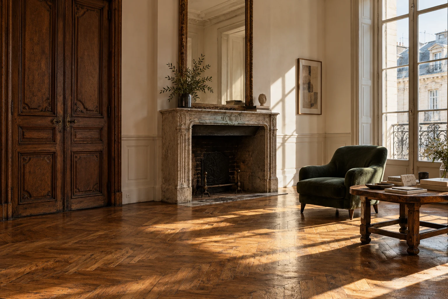
Illustrative historic interior with original timber doors, parquet flooring and a stone fireplace
A DIFFERENT STARTING POINT

The next chapter
starts with what remains.

Architectural concept imagery
+Original timber door Evidence to review ↗+Oak parquet Compare pathways ↗
DECISION WORKSPACE 01 / 03

One element.
Three possible futures.

RetainRepairReplace
Built around evidence. Reviewed by people. ↗
A considered approach to the existing.DOCUMENT → COMPARE → REVIEW → HANDOVER↓

Keeping something
is a design decision.

A door. A floor. A built-in shelf.
Each has a past — and a possible future.

Renovation decisions need more than a final specification. They need a record of the condition, the alternatives, the unknowns and the reasons behind the choice.

RETAIN explores a focused way to bring that thinking together, before a replacement is specified.

A workflow hypothesis we’re preparing to test.
01

See what exists.

Build a structured inventory of the elements already in a space, with photographs and condition notes.

02

Make the options visible.

Compare retaining, repairing and replacing. Keep quotes, technical checks and evidence gaps alongside each option.

03

Carry the reasoning forward.

Connect a client review to a specific version, then hand over a clear record of what was decided and why.

A clearer view.
A considered choice.

Explore how an existing element could become
a traceable renovation decision.

INTERACTIVE CONCEPT · FICTIONAL DATA
Get a feel for the thinking.A five-step guided look inside the concept.
The Courtyard Apartment / Existing elementsCONCEPT v1.0
EXISTING ELEMENTS

A place to start.

Select an element to explore its options.

COMPARE PATHWAYSVersion 1

Original timber door

Keep the original character.

Keep the existing door, subject to a professional condition and suitability review.

ILLUSTRATIVE COST€180
ILLUSTRATIVE TIME1–2 days
✓Illustrative condition photographSAMPLE
!Professional door assessmentNEEDED
!Confirmed supplier quoteNEEDED

Sample estimates. No safety assessment or environmental savings are implied.

Illustrative concept. No client accounts or live project data.
Purpose-built for the decision before procurement.HUMAN JUDGMENT. VISIBLE EVIDENCE.

From “what’s here?”
to “here’s why.”

Designed to make the reasoning as clear
as the final selection.

01

Capture

Record the element,
condition and context.

02

Compare

Explore retain, repair
and replace options.

03

Connect

Link the sources.
Expose the unknowns.

04

Review

Record a client decision
against a specific version.

05

Handover

Keep an exportable
decision register.

A MORE CONSIDERED START

The most interesting
material might be
the one already there.

RETAIN makes space for that possibility.
A practical digital layer for thoughtful renovation.

EXISTING → POSSIBLE

Designed.
Now, to validate.

The visual identity and interactive concept are prepared. The next step is to learn from the professionals who would use it.

CURRENT STAGE
Early-stage concept

RETAIN is not yet incorporated or commercially launched. There are no verified customer interviews, pilots or paying customers.

PREPARED / 01

A tangible starting point.

Problem hypotheses, brand identity, a fictional-data front-end demonstration and a draft validation plan.

Concept prepared
PLANNED / 02

Listen to real studios.

Interview 8–12 practising architects and interior designers about recent renovation decisions. Test the workflow, including reasons it may not be useful.

Discovery & usability
PLANNED / 03

Build around the evidence.

Use the findings to narrow the product, establish a separate venture and build an accessible MVP around a validated need.

Focused MVP
PLANNED / 04

Learn through real use.

Seek permission for small pilots, test studio subscription against per-project pricing, and evaluate repeat use and willingness to pay.

Pilot & business-model testing
A FEW USEFUL DETAILS

Clear by design.

Who is RETAIN intended for?+

Small architecture and interior-design practices working on refurbishment projects, with designers and clients who need to understand and record choices about existing elements.

Is this a launched software product?+

No. This is an early-stage venture concept with an interactive front-end demonstration. All project records, costs and durations shown here are fictional. Professional discovery, external usability testing and pilots remain planned.

Does RETAIN decide what is safe to reuse?+

Technical suitability and safety remain with qualified professionals. The proposed workspace organises evidence and decisions; it does not certify materials, structural safety or environmental savings.

How would the venture generate revenue?+

A B2B software model is planned, subject to validation. The intention is to test a monthly studio subscription against per-project pricing. Pricing, customer demand and commercial viability have not yet been established.

What would funding help make possible?+

The proposed next phase focuses on professional discovery, usability testing, a separate legal venture, a narrowly scoped accessible MVP and small pilots. The aim is to determine whether the workflow solves a frequent, valuable problem before scaling it.

LET’S SHAPE THE NEXT CHAPTER

A better future
for what already exists.

For incubation, research conversations
and early collaboration.

ILLUSTRATIVE CLIENT REVIEW

A decision with context.

REVIEW STATUSEvidence still required

This records a sample preference in this browser session. It is not a technical approval or a real client decision.

A GUIDED PERSPECTIVE
01/ 05

Start with what exists.

Use ← → to navigate · Esc to close

NILLY NG 02 CDESIGN / CASE STUDYAll projects

FROM IDEA TO APPLICATION

Product2Place AIAI product visuals & art direction

Product photography placed within new visual environments. AI-assisted image creation and art direction explore light, scale and the relationship between an object and its setting.

Explore the visual presentation
NG 02 C / Product2Place AIDESIGN BY NILLY GRAPHICS
Product2Place AI — AI product visuals & art direction
DISCIPLINE
AI product visuals & art direction
DESIGN
Sotiris Christos / Nilly Graphics
PRESENTATION
28 project images

01 / DESIGN DIRECTION

From product photograph to scene

Furniture and other products are presented alongside alternative visual applications. Setting and atmosphere place the object within a more complete image of use.

02 / VISUAL LANGUAGE

Design-led image creation

Proportions, perspective, floor contact and shadows are central to the compositions. The setting serves the identity of the product and the message of each application.

Explore the complete collection21 more images

03 / APPLICATIONS

Visual applications for products

The collection includes identity work, original photographs and creative compositions, exploring directions for e-commerce, social media and campaigns.

YOUR NEXT PROJECT

The next idea
deserves character.

NEXT PROJECT / NG 03 CKOOZLogo design & music identity

NILLY NG 01 CINDEPENDENT PRODUCT / CASE STUDYAll projects

BRAND → DIGITAL PRODUCT

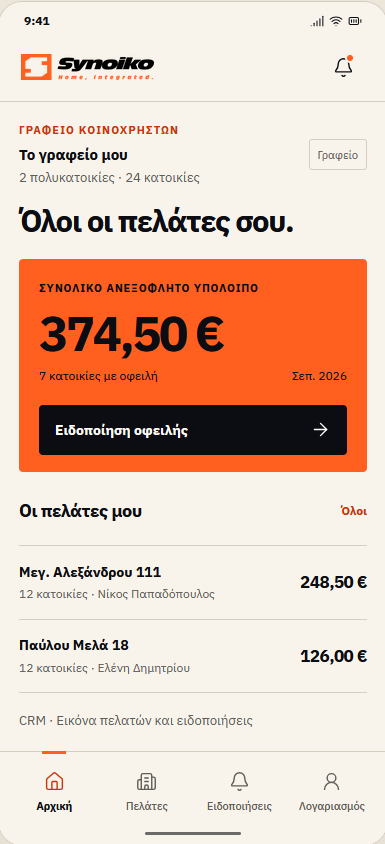
Synoiko.Branding & SaaS UI/UX Design

One identity.
A whole ecosystem.

From the first symbol to the everyday experience of a building-management platform.

The story behind the project
SYNOIKO / PRODUCT EXPERIENCEWEB APP + MOBILE DESIGN
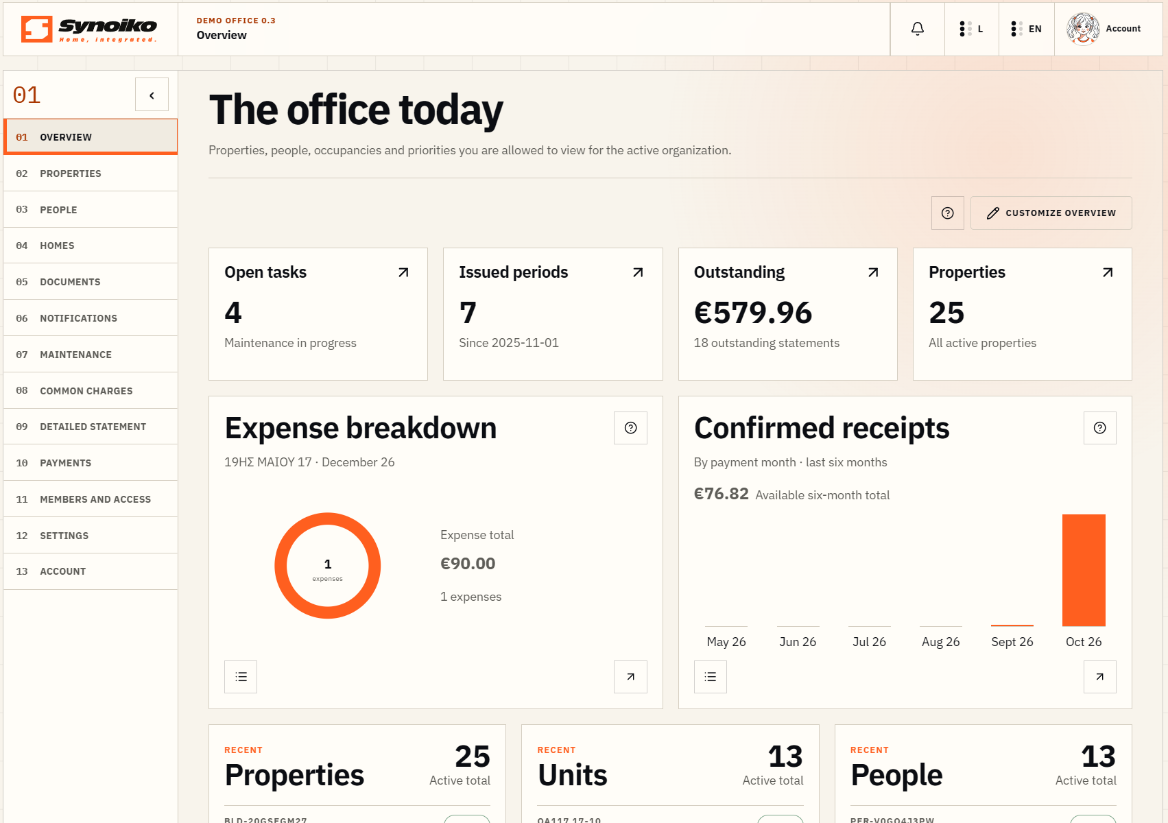
SYNOIKO / OFFICE
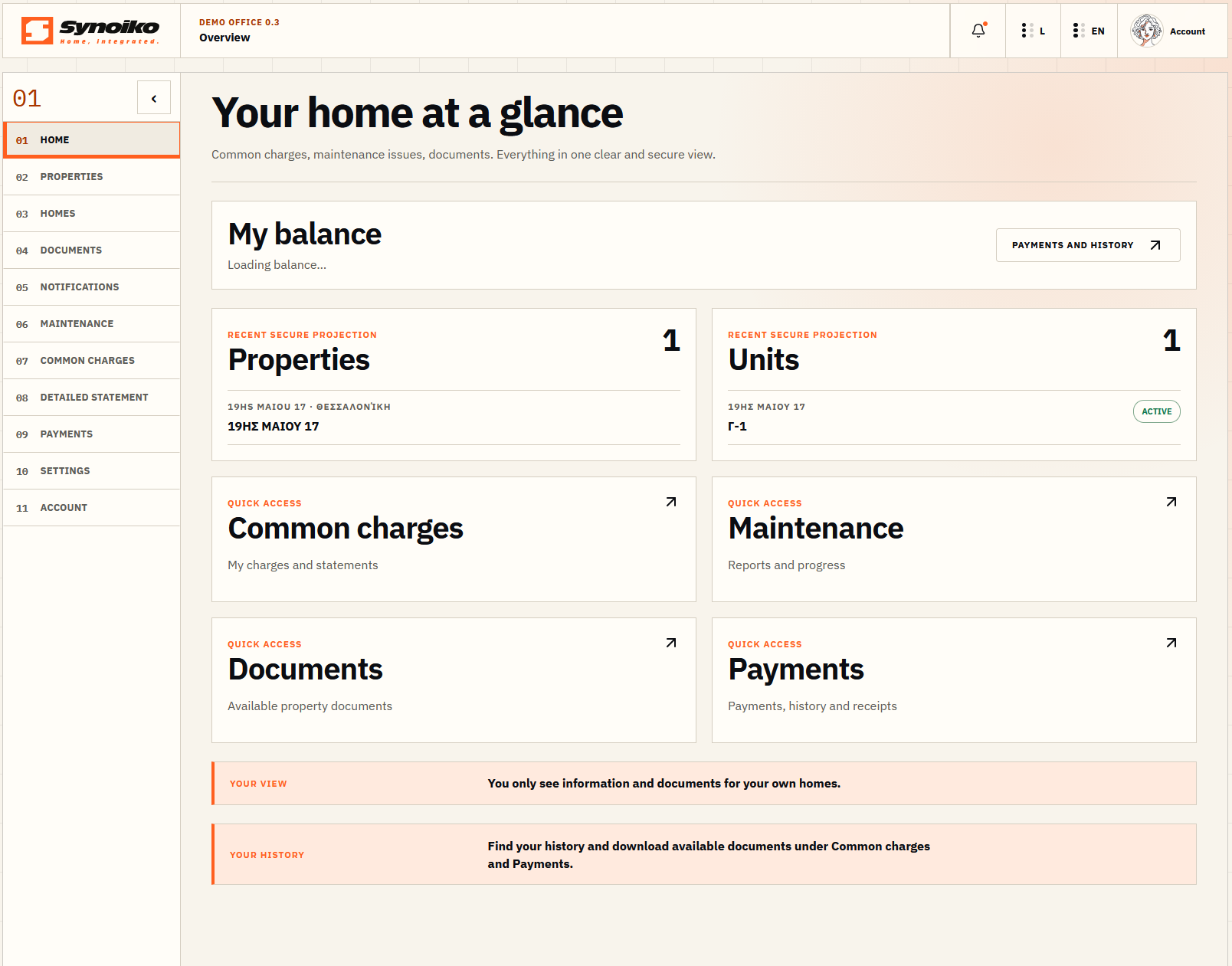
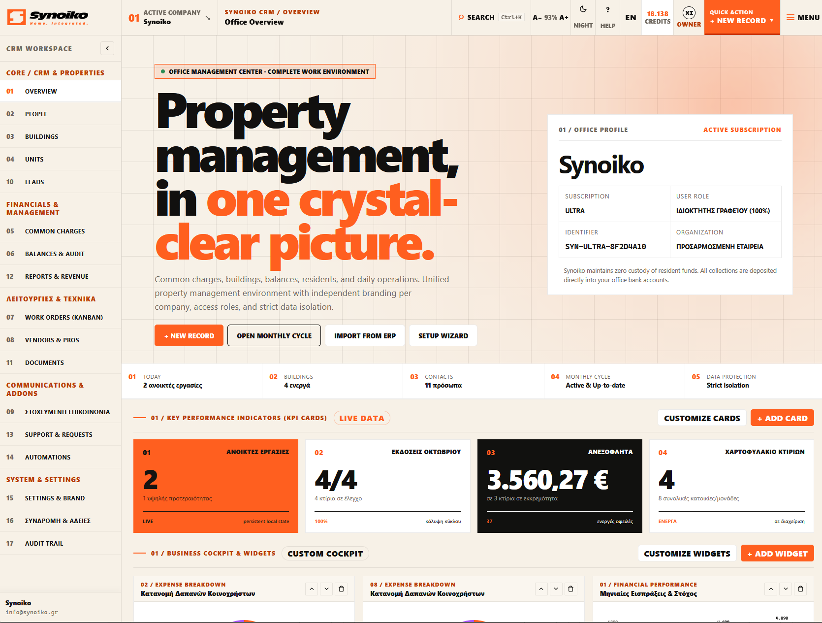
Synoiko — office screen with buildings and financial overview
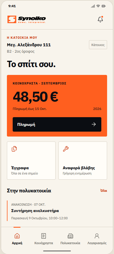
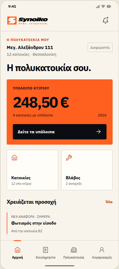
Synoiko Mobile — resident UI prototype, Greek interfaceMOBILE / PROTOTYPE
Web application screen · mobile prototype in development.Inside the Proof Room ↗
THE PROJECT
Independent SaaS product
MY ROLE
Strategy · Branding · UX/UI · Development
THE ECOSYSTEM
Website · Web app · CRM · Admin

01 / THE CHALLENGE

Product strategy.
Shared logic.

The office sees many buildings. The manager sees one. The resident sees their own home.

The challenge was to organise this complexity with the right information for each person. I designed Synoiko around roles and tasks, using shared navigation patterns and clear hierarchy.

My own digital product. From strategy and identity to UX/UI and development.

01Office
02Building
03Home
04Person

02 / BRAND IDENTITY

Brand identity
with character.

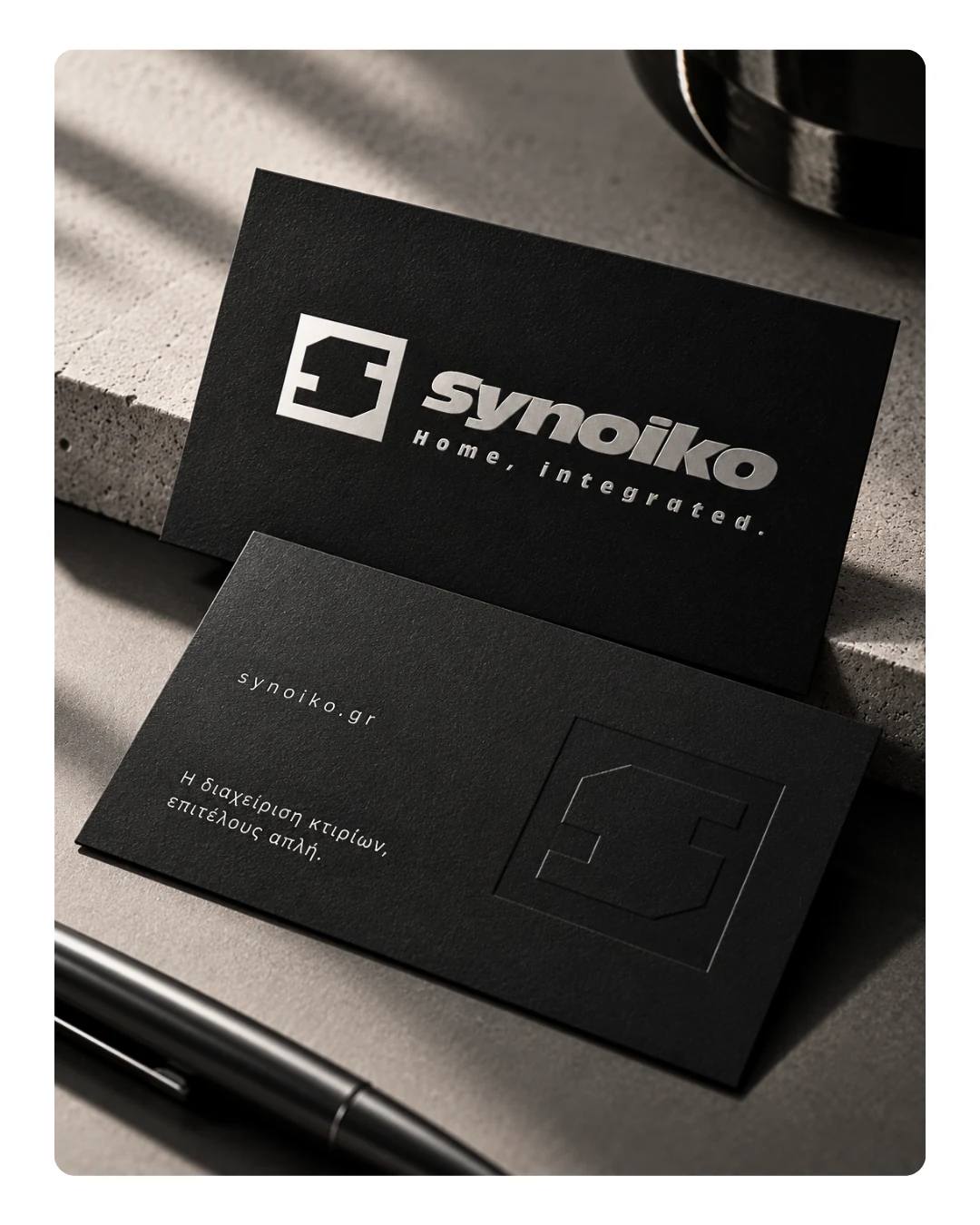
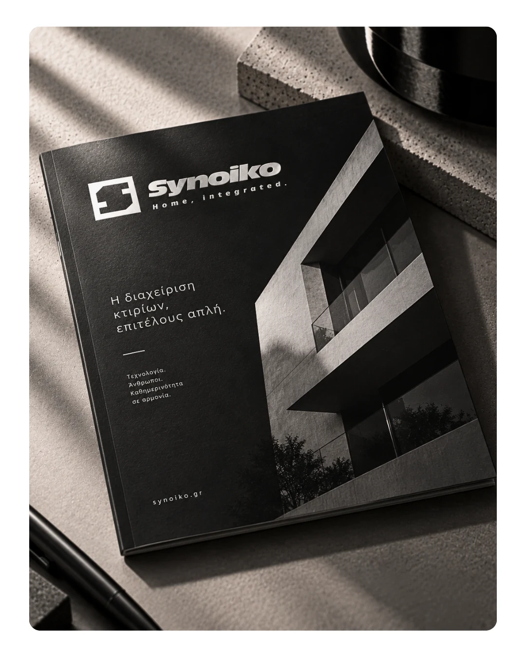
A geometric symbol, a bold wordmark and an orange accent. An identity that connects physical touchpoints with the language of the product.

Synoiko — mockup επαγγελματικών καρτών
01 / BUSINESS CARDSIDENTITY APPLICATION
Synoiko — mockup έντυπης παρουσίασης
02 / PRINT & EDITORIALBRAND TOUCHPOINT

03 / USER EXPERIENCE

SaaS interface design.
Your perspective.

Choose a role to see how the information changes while the design logic stays consistent.

The big picture. The right priorities.

Buildings, common-charge statements and open tasks in one overview. Balances and pending actions stand out before the user moves into the detail.

DESIGN DEMO / OFFICE
Synoiko — Management office
Interface presentation with demonstration data.

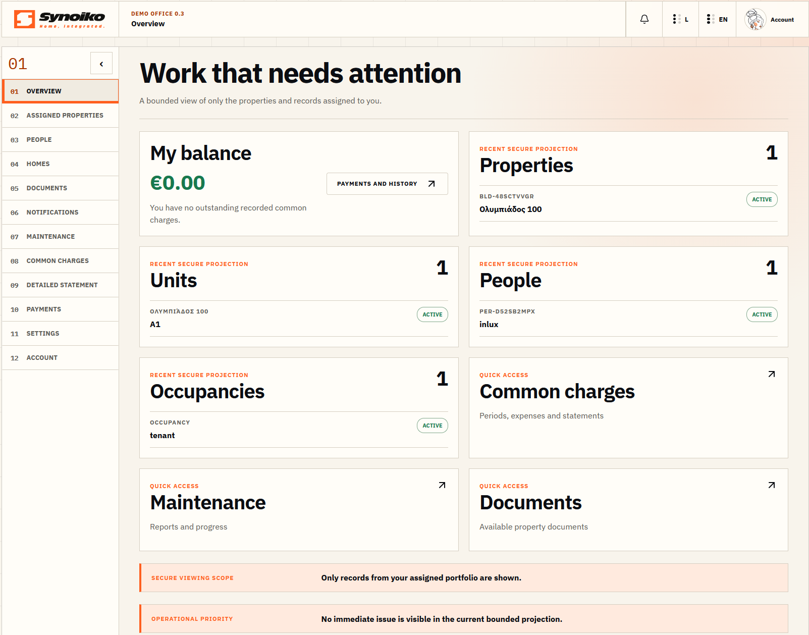
Their home, at a glance.

Charges, documents and requests within easy reach. A simple structure follows the needs of the resident.

DESIGN DEMO / RESIDENT
Synoiko — Resident & owner
Interface presentation with demonstration data.

Everything that matters to their building.

Balances, homes and tasks organised around one building. The same visual language, with a different focus.

DESIGN DEMO / MANAGER
Synoiko — Building manager
Interface presentation with demonstration data.

A shared view of the portfolio.

The professional CRM brings portfolio and financial information into a shared navigation system. The information is shaped around the work of the office.

DESIGN DEMO / CRM
Synoiko — CRM workspace
Interface presentation with demonstration data.

One place to oversee the ecosystem.

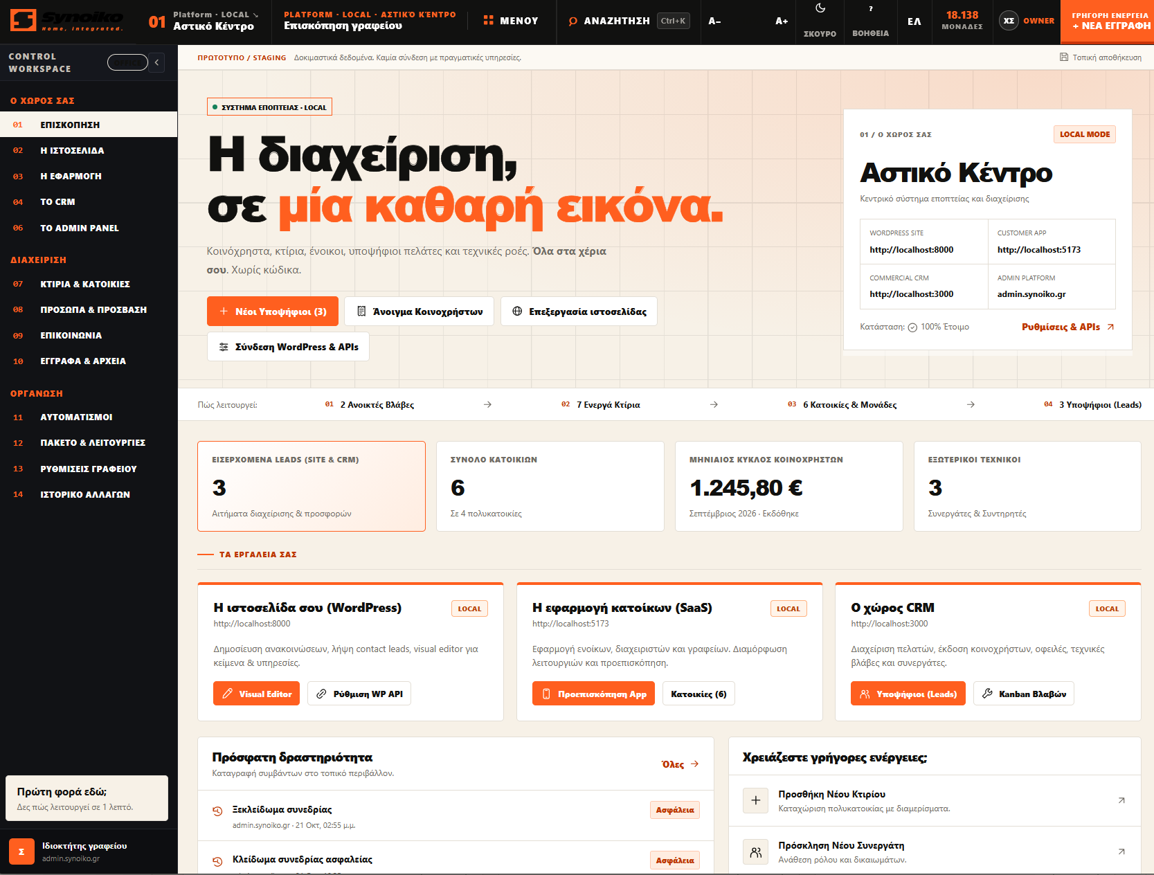
A design prototype for overseeing the website, application and CRM. The screen presents a local demonstration environment with test data. The interface is in Greek.

DESIGN DEMO / ADMIN
Synoiko — Admin Panel
Central administration design prototype · local demonstration environment, Greek interface.

04 / DESIGN DECISIONS

The thinking behind the interface.

01

Tasks come first.

The overview highlights actions that need attention. Details follow.

02

Clear hierarchy.

Amounts, periods and statuses have distinct visual weights, so they can be scanned quickly.

03

Consistency throughout.

Navigation, tables and forms follow shared patterns across the web app, CRM and admin.

05 / MOBILE EXPLORATION

Synoiko Mobile.
Android UI design.

PROTOTYPE / IN DEVELOPMENT

The same visual language on Android, with an experience designed for each role. Not yet available to download.

01 / Resident

Synoiko Mobile — Resident — UI prototype
UI PROTOTYPEEnlarge ↗

02 / Manager

Synoiko Mobile — Manager — UI prototype
UI PROTOTYPEEnlarge ↗

03 / Office

Synoiko Mobile — Office — UI prototype
UI PROTOTYPEEnlarge ↗

FROM IDEA TO EXPERIENCE

The next product
could be yours.

NEXT PROJECT / NG 02 CProduct2Place AIAI / PRODUCT IMAGERY

NILLY NG 03 CDESIGN / CASE STUDYAll projects

FROM IDEA TO APPLICATION

KOOZLogo design & music identity

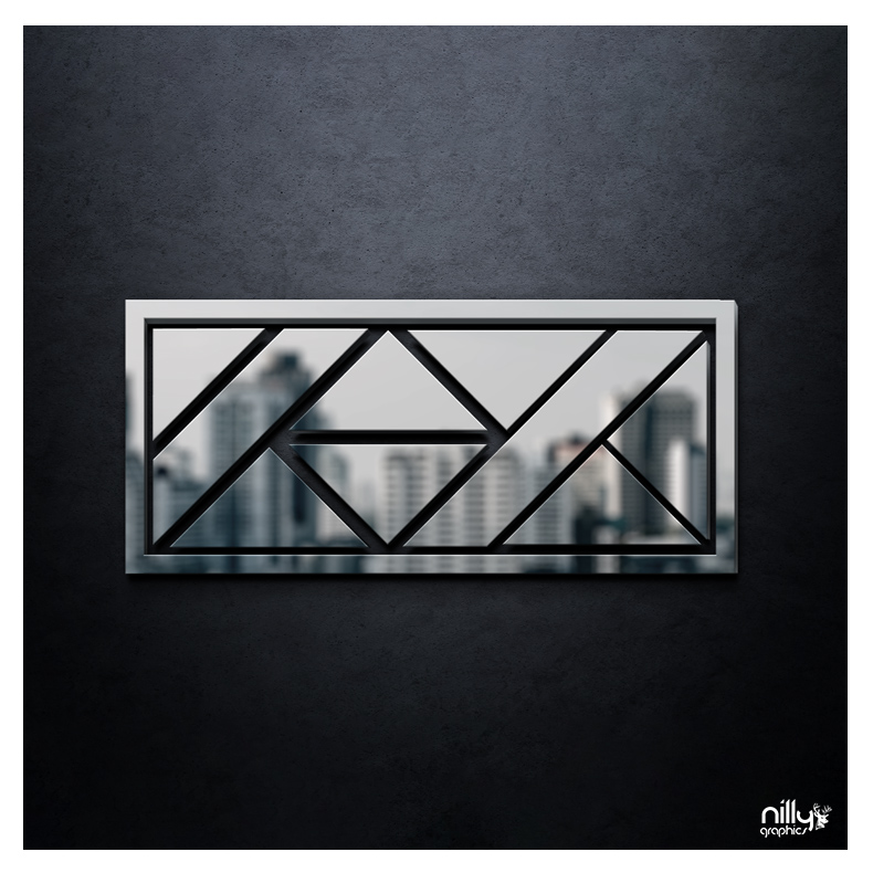
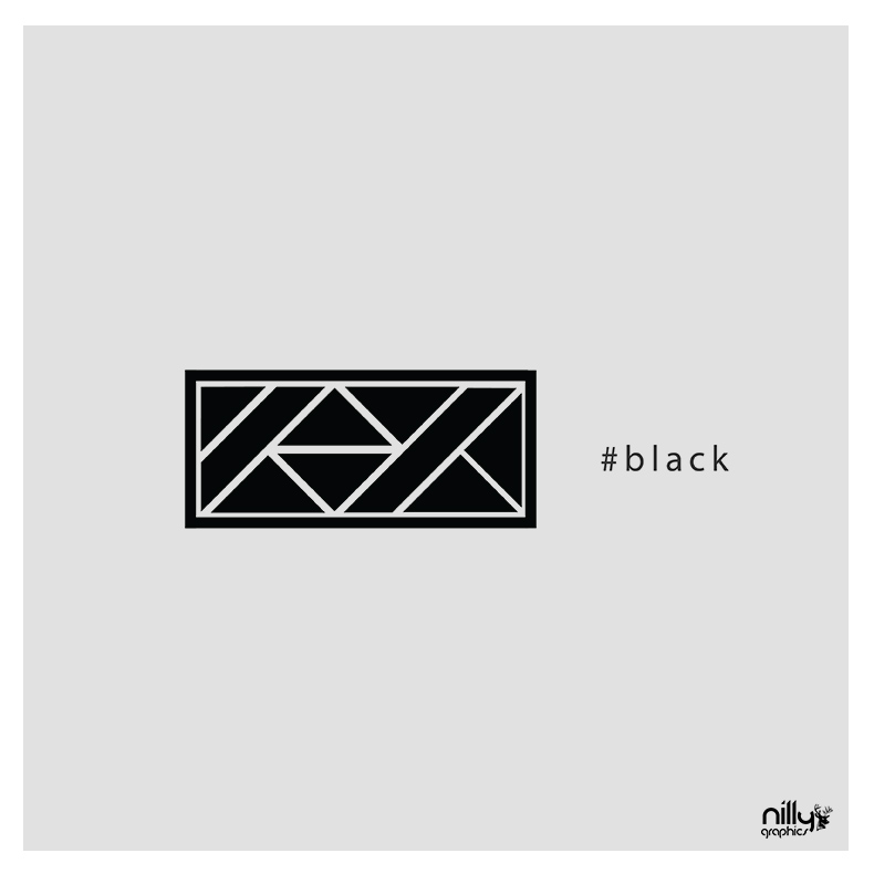
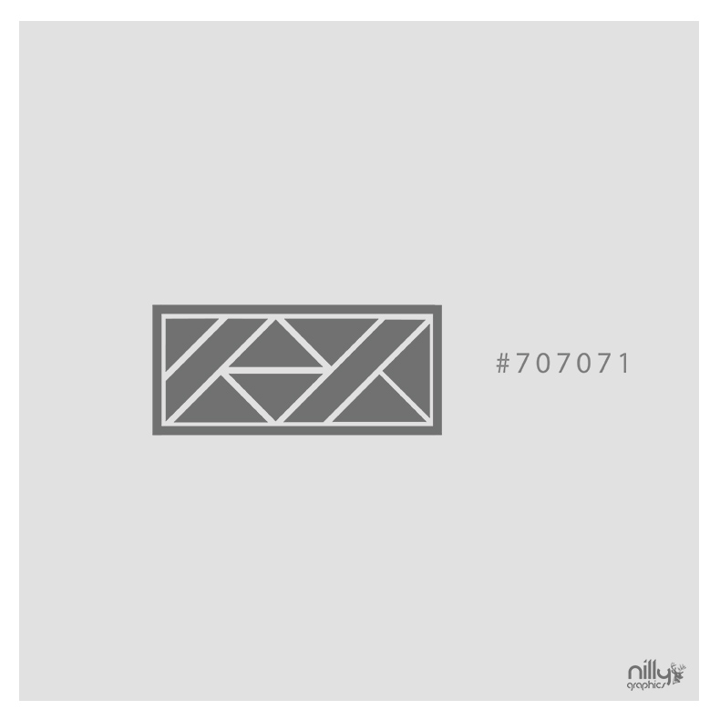
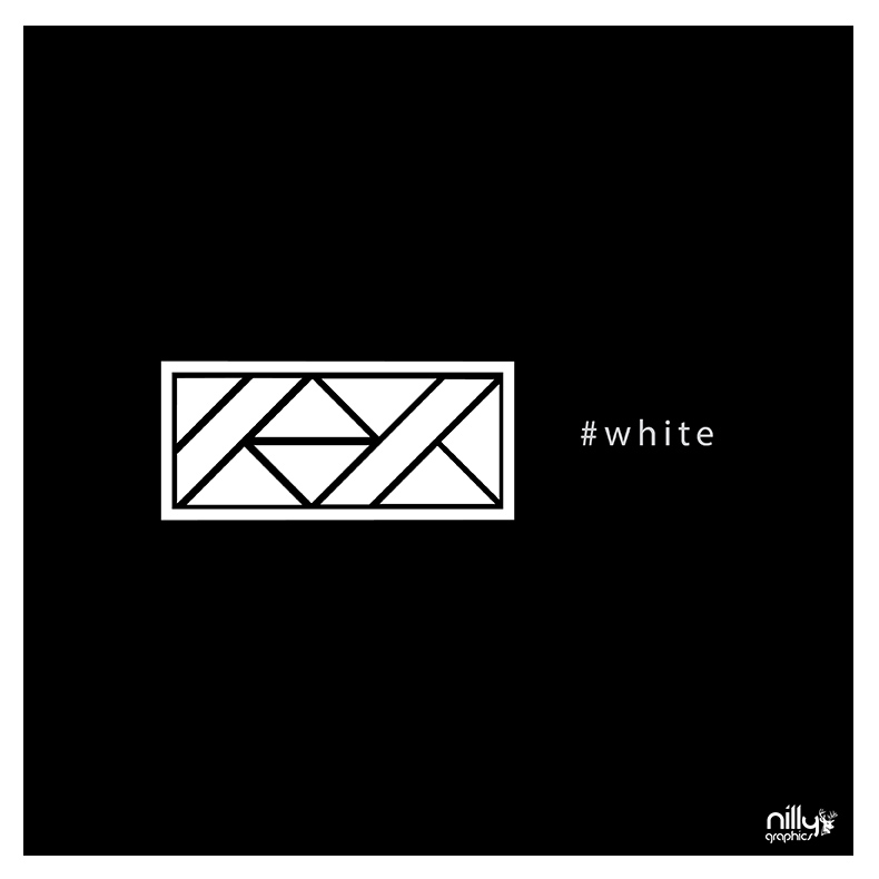
A logo-design project for a music artist. Diagonal lines and internal spaces create a distinctive, compact geometric mark.

Explore the visual presentation
NG 03 C / KOOZDESIGN BY NILLY GRAPHICS
KOOZ — Logo design & music identity
DISCIPLINE
Logo design & music identity
DESIGN
Sotiris Christos / Nilly Graphics
PRESENTATION
8 project images

01 / DESIGN DIRECTION

Geometry and rhythm

Triangles, diagonals and diamond-like relationships sit within a horizontal frame. Repetition and changes of direction connect the mark with a musical identity.

02 / VISUAL LANGUAGE

Positive and negative

Light and dark applications reveal the geometry of the symbol. A limited palette keeps attention on its outline and proportions.

Explore the complete collection1 more images

03 / APPLICATIONS

The identity in application

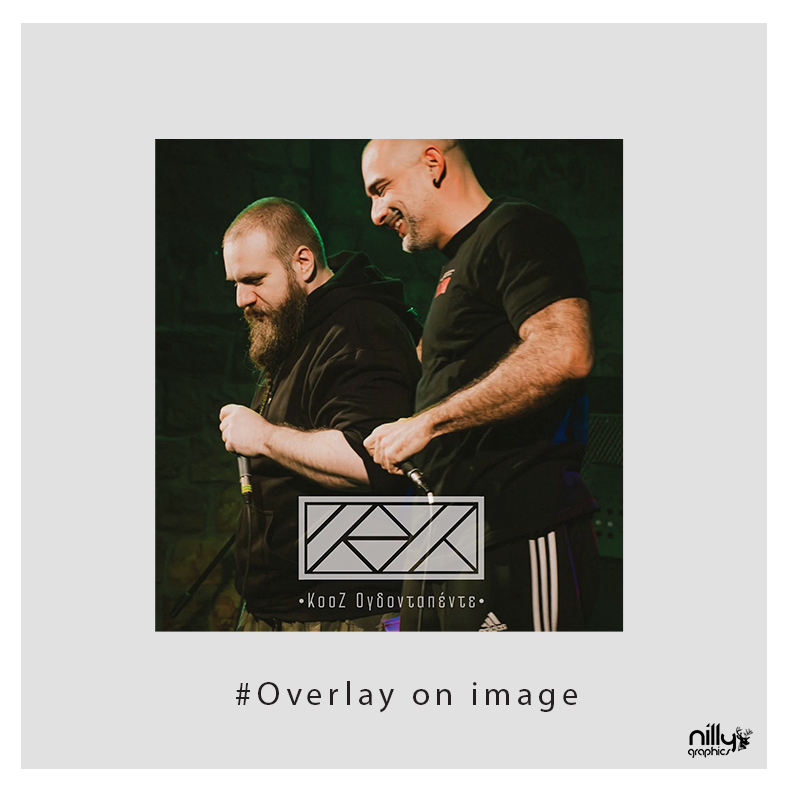
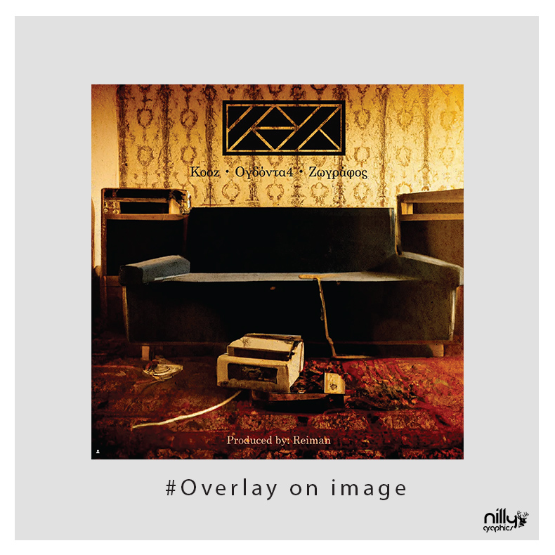
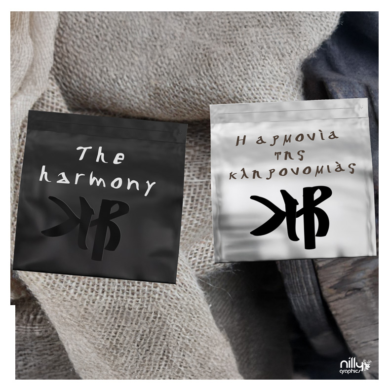
Mockups translate the flat mark into different materials and contexts. The work combines logo design with art direction for a consistent visual presentation.

YOUR NEXT PROJECT

The next idea
deserves character.

NEXT PROJECT / NG 04 CΜαρία ΒλαχονικολούLogo design & brand identity

NILLY NG 09 CDESIGN / CASE STUDYAll projects

FROM IDEA TO APPLICATION

City MapsVector illustration & poster design

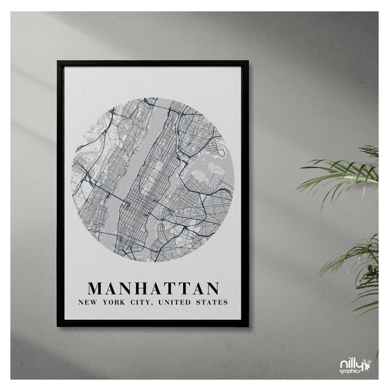
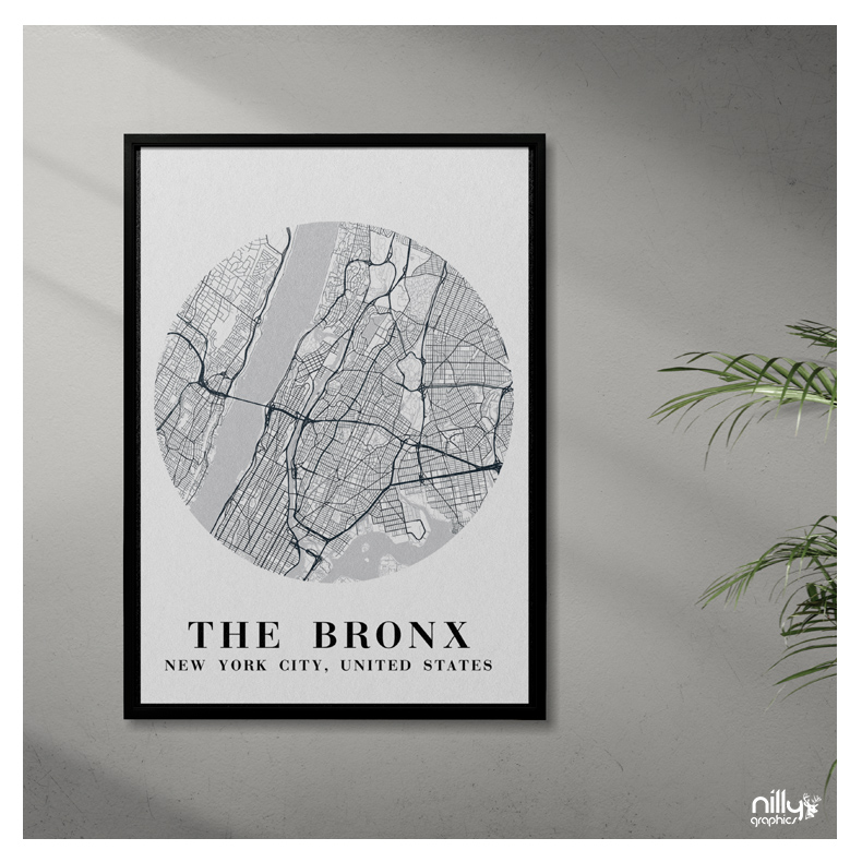
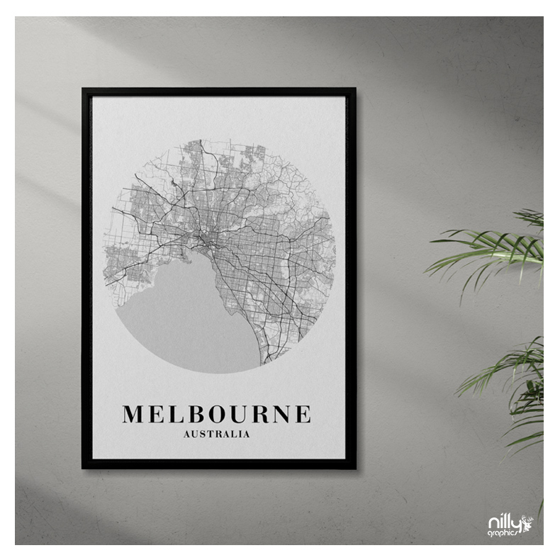
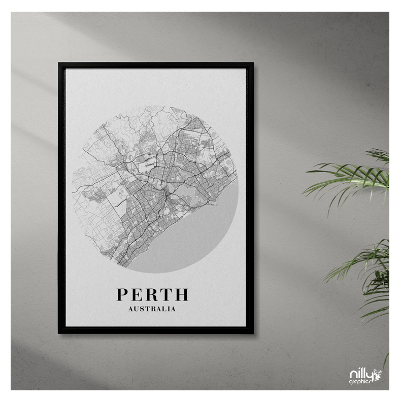
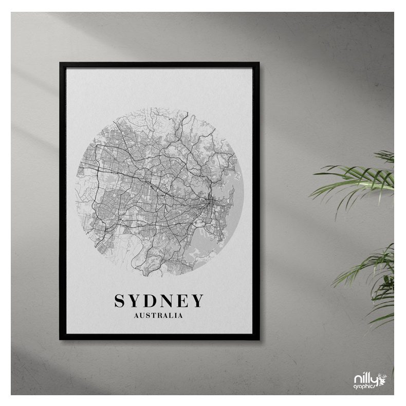
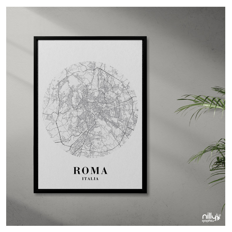
Seven city-map illustrations designed as graphic compositions for posters. Streets, open spaces and changing urban density form a shared circular structure.

Explore the visual presentation
NG 09 C / City MapsDESIGN BY NILLY GRAPHICS
City Maps — Vector illustration & poster design
DISCIPLINE
Vector illustration & poster design
DESIGN
Sotiris Christos / Nilly Graphics
PRESENTATION
7 project images

01 / DESIGN DIRECTION

The map as a graphic composition

A monochrome approach highlights the detail of the line. Each city retains its own rhythm within the consistent circular outline.

02 / VISUAL LANGUAGE

Seven urban characters

Berlin, Manhattan, the Bronx, Melbourne, Perth, Sydney and Rome are presented with a shared typographic hierarchy for the place name and country.

03 / APPLICATIONS

Prints in context

Framed mockups show the illustrations in interior settings. The related vector product is available in the shop as Isometric illustrations maps.

AVAILABLE IN THE SHOP

City Maps

View file formats, licensing and the full product details.

View the product

Original price was: 29,90 €.Η τρέχουσα τιμή είναι: 9,90 €.Προσθήκη στο καλάθι

YOUR NEXT PROJECT

The next idea
deserves character.

NEXT PROJECT / NG 10 CBLK VLT MagazineBrand identity & web design

NILLY NG 25 CTYPE DESIGN / PORTFOLIOAll projects

CHARACTERS / FORM / EXPRESSION

NP WashingtonianusDisplay typeface design

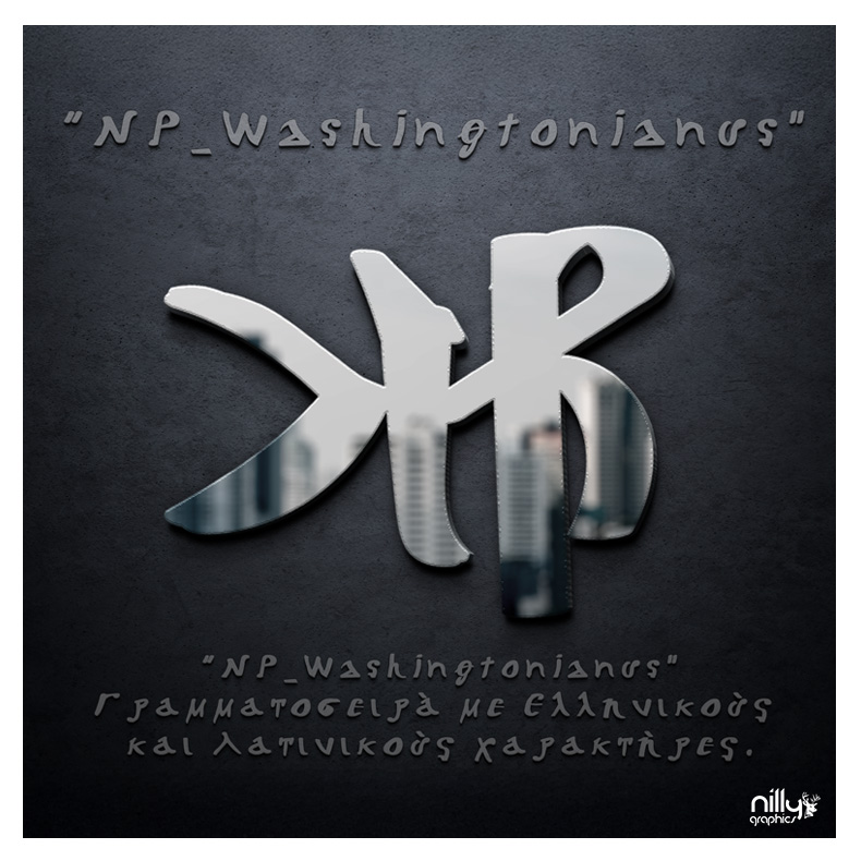
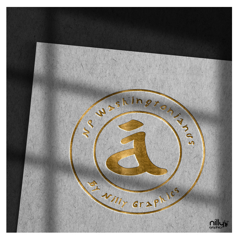
An independent typeface project connecting character specimens with sculptural, material treatments. Typography is explored as a visual object as well as a system of letters.

Explore the visual presentation
NG 25 C / NP WashingtonianusDESIGN BY NILLY GRAPHICS
NP Washingtonianus — Display typeface design
DISCIPLINE
Display typeface design
DESIGN
Sotiris Christos / Nilly Graphics
PRESENTATION
5 project images · Regular

01 / DESIGN DIRECTION

Character and presence

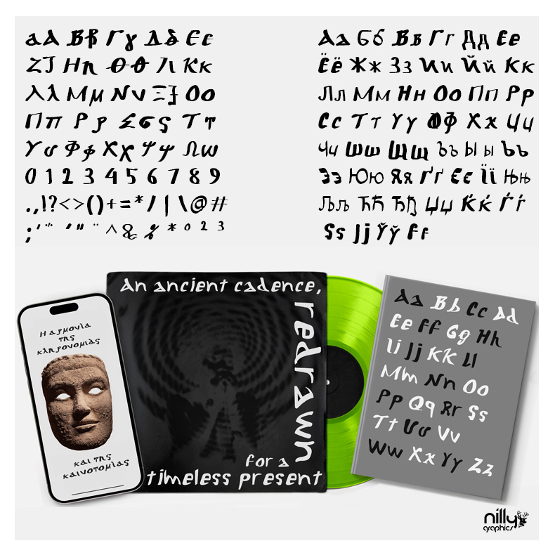
Distinctive terminals and relationships between neighbouring letters shape the design. The project investigates the visual presence of the letter beyond an alphabet listing.

02 / VISUAL LANGUAGE

A metallic presentation

Dark metallic art direction reveals edges and surfaces. Additional specimens provide a direct reading of the Regular letterforms.

03 / APPLICATIONS

From design to application

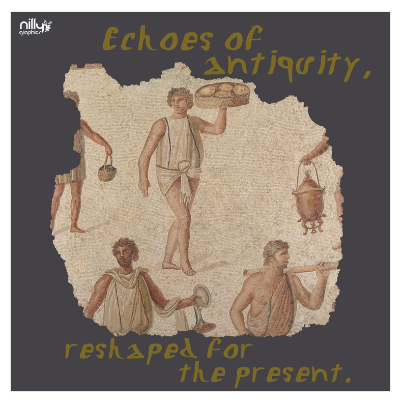
The portfolio presents character design and illustrative applications. The product page provides the current availability of the typeface.

AVAILABLE IN THE SHOP

NP Washingtonianus

View file formats, licensing and the full product details.

View the product

Original price was: 29,90 €.Η τρέχουσα τιμή είναι: 9,90 €.Προσθήκη στο καλάθι

YOUR NEXT PROJECT

The next idea
deserves character.

NEXT PROJECT / NG 01 CSynoikoBranding & SaaS UI/UX

NILLY NG 24 CTYPE DESIGN / PORTFOLIOAll projects

CHARACTERS / FORM / EXPRESSION

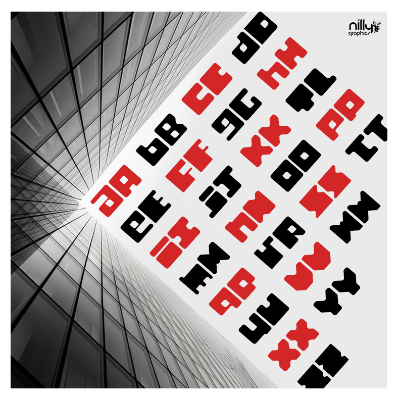
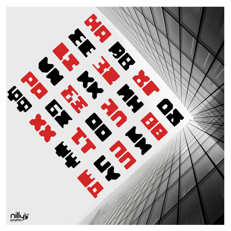
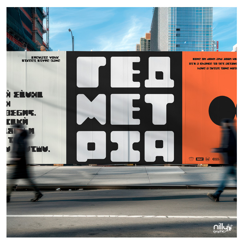
NP Forma CinqueGeometric display typeface design

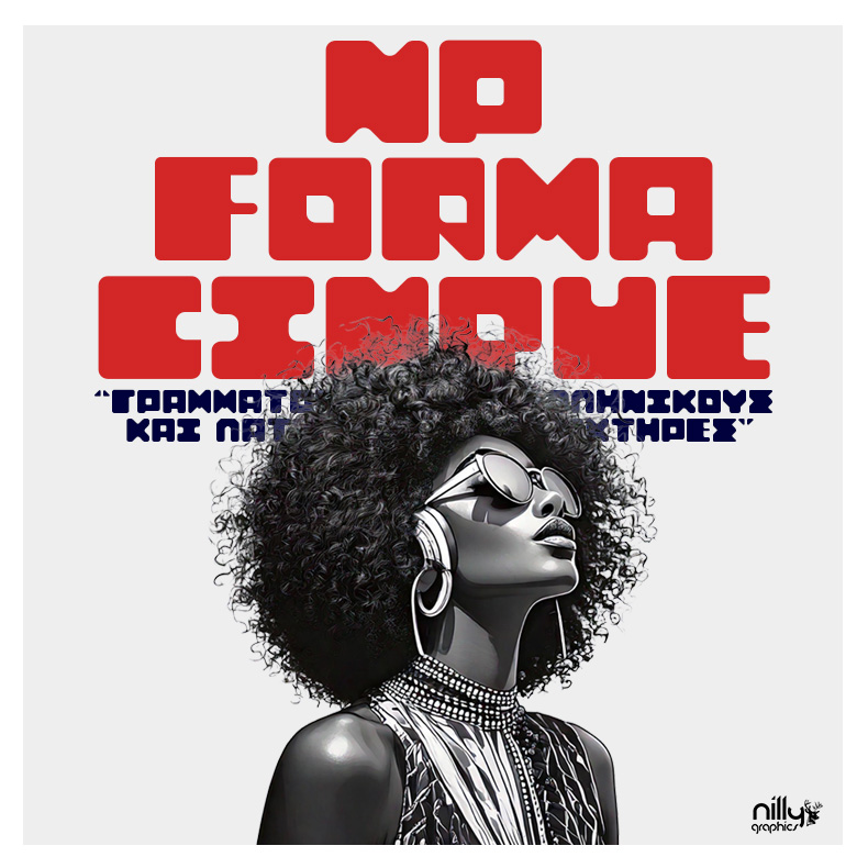
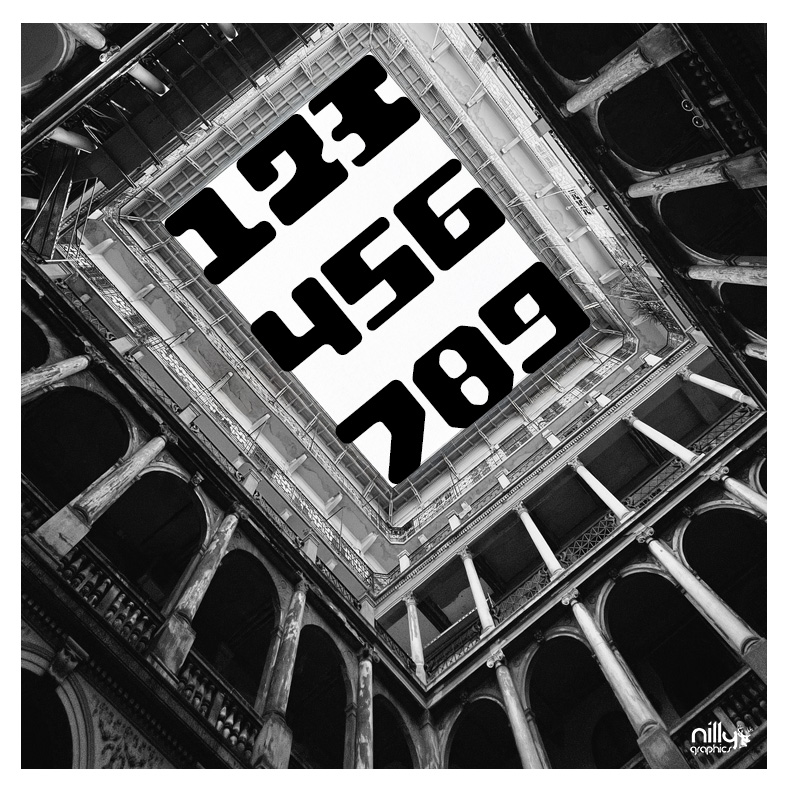
A typeface study built from full geometric forms. Strong visual weight allows a short word to become the dominant element of a composition.

Explore the visual presentation
NG 24 C / NP Forma CinqueDESIGN BY NILLY GRAPHICS
NP Forma Cinque — Geometric display typeface design
DISCIPLINE
Geometric display typeface design
DESIGN
Sotiris Christos / Nilly Graphics
PRESENTATION
6 project images · Regular

01 / DESIGN DIRECTION

Weight and detail

Large letter surfaces are balanced by rounded corners and clear internal openings. Small cuts give the solid forms their distinctive character.

02 / VISUAL LANGUAGE

A typographic surface

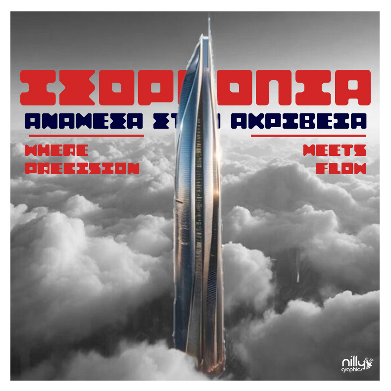
Red headlines sit over a monochrome portrait in the main poster. Repeated lines show how the typeface can create surface, structure and rhythm.

03 / APPLICATIONS

Display applications

The specimens explore large headlines, colour and composition, showing the role of the typeface within a poster or cover.

AVAILABLE IN THE SHOP

NP Forma Cinque

View file formats, licensing and the full product details.

View the product

Original price was: 29,90 €.Η τρέχουσα τιμή είναι: 9,90 €.Προσθήκη στο καλάθι

YOUR NEXT PROJECT

The next idea
deserves character.

NEXT PROJECT / NG 25 CNP WashingtonianusDisplay typeface design

NILLY NG 11 CDESIGN / CASE STUDYAll projects

FROM IDEA TO APPLICATION

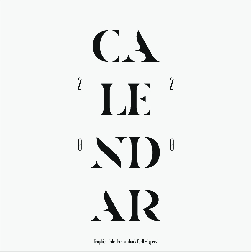
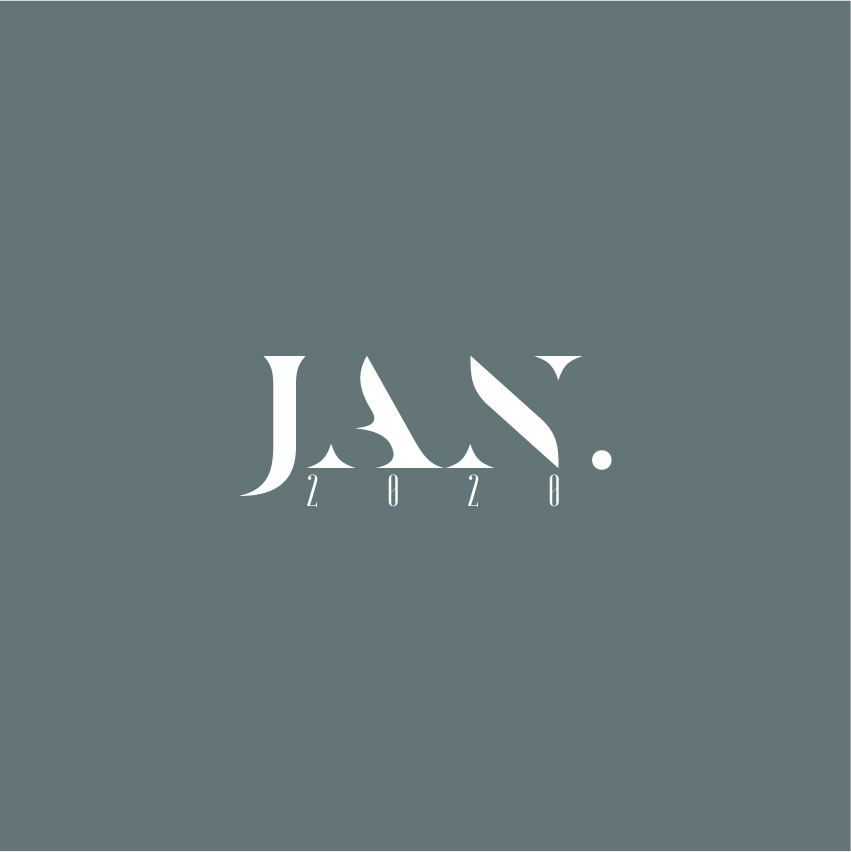
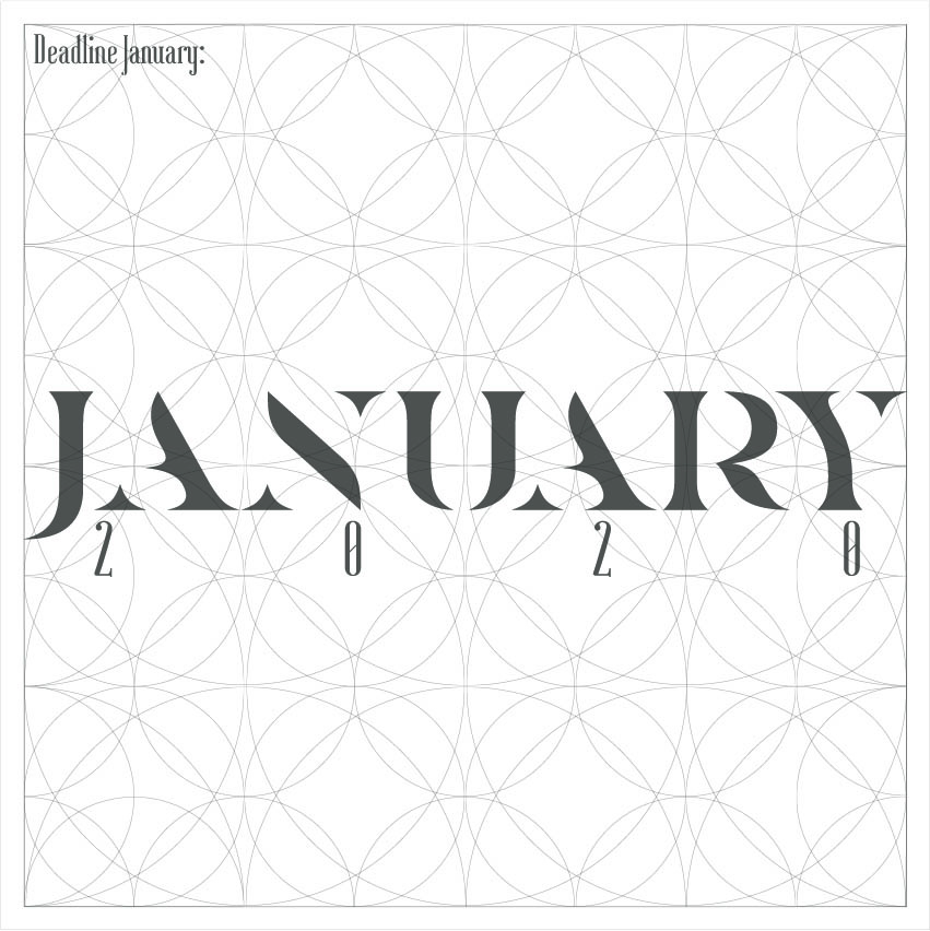
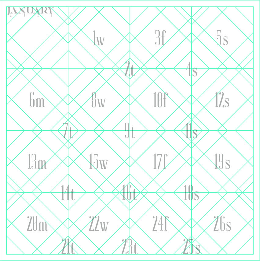
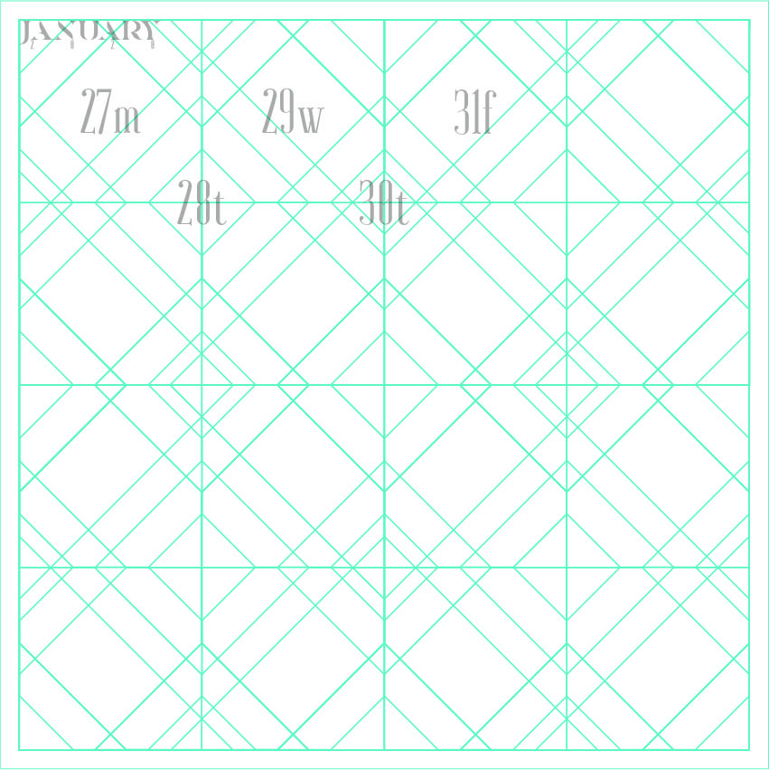
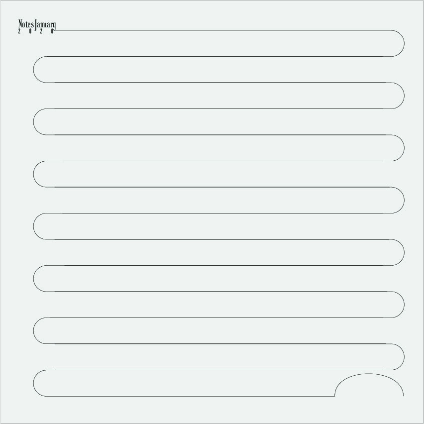
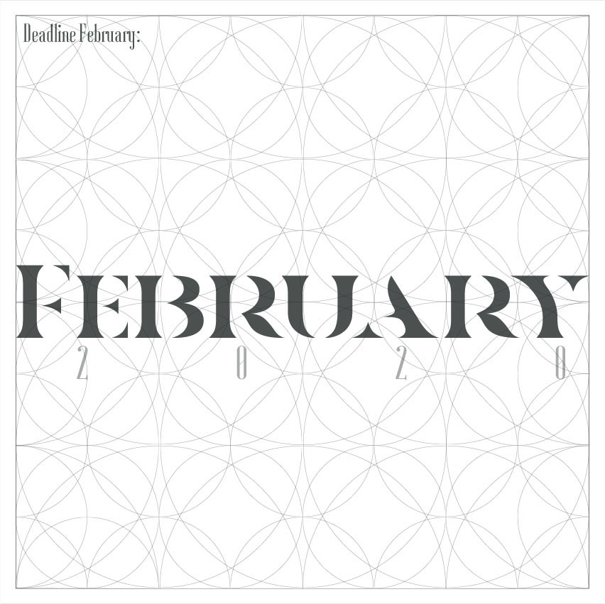
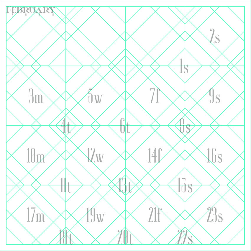
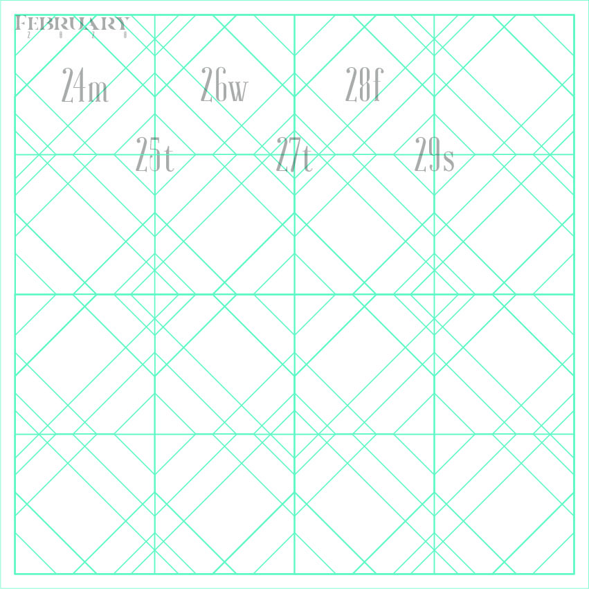
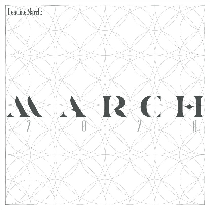
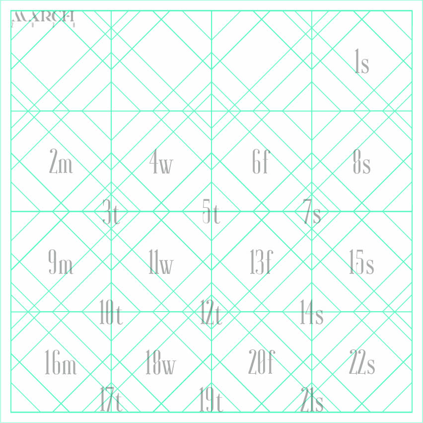
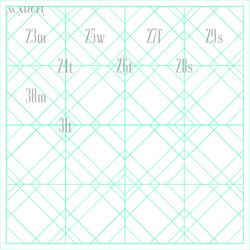
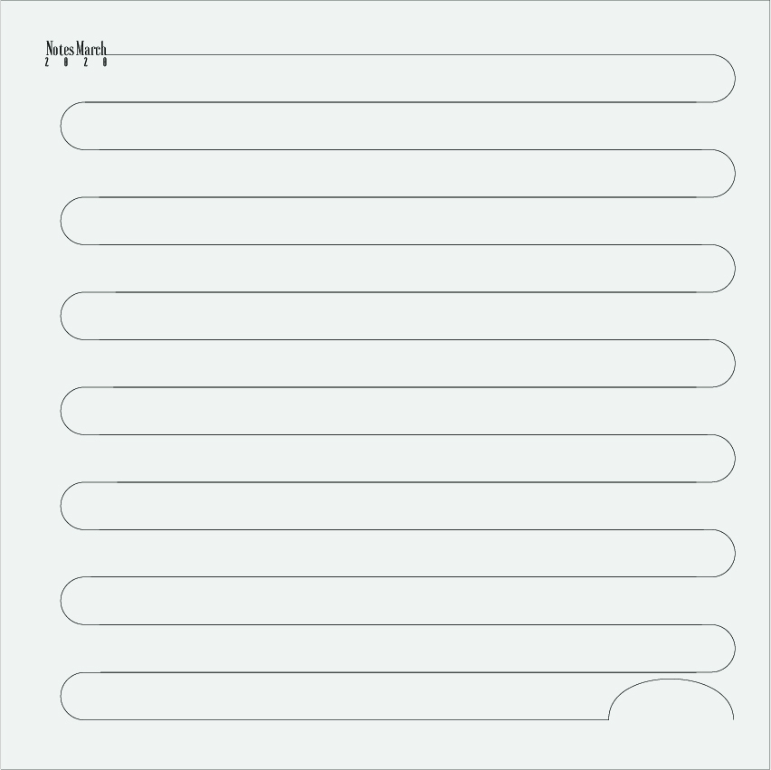
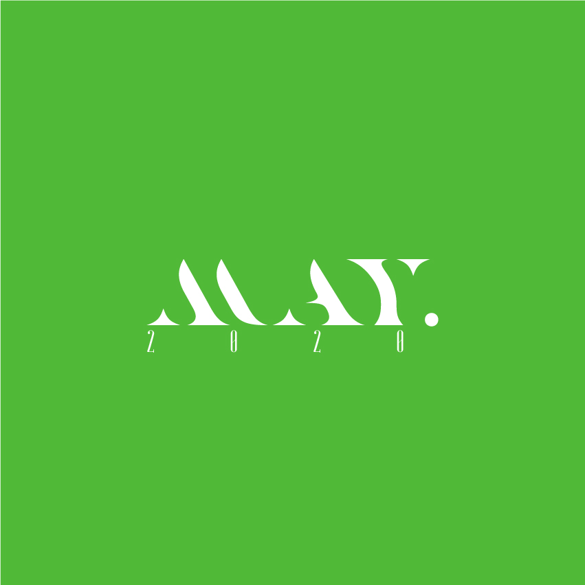
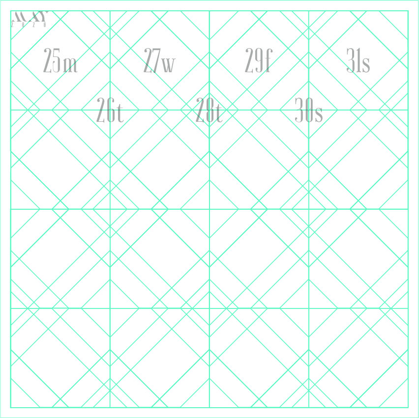
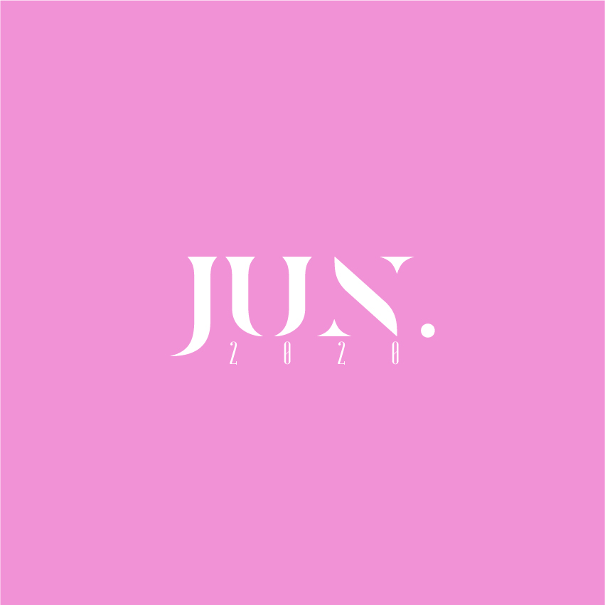
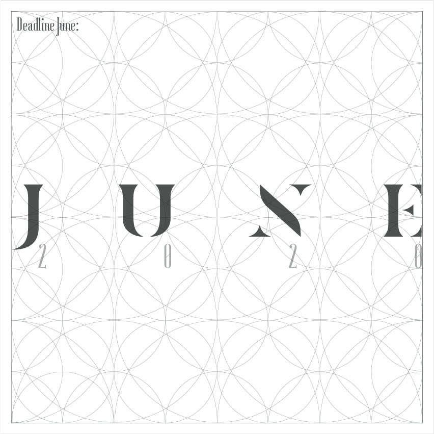
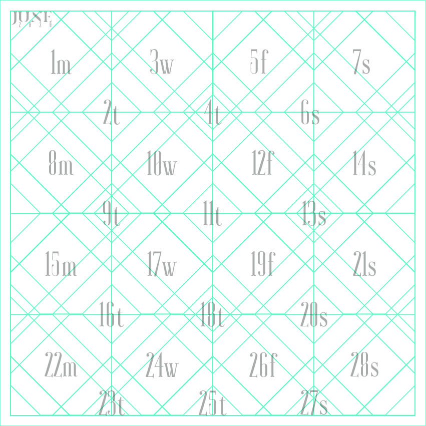
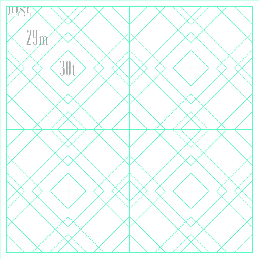
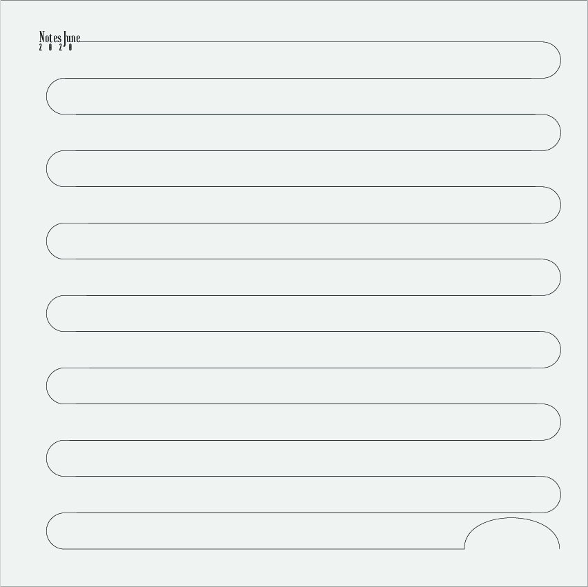
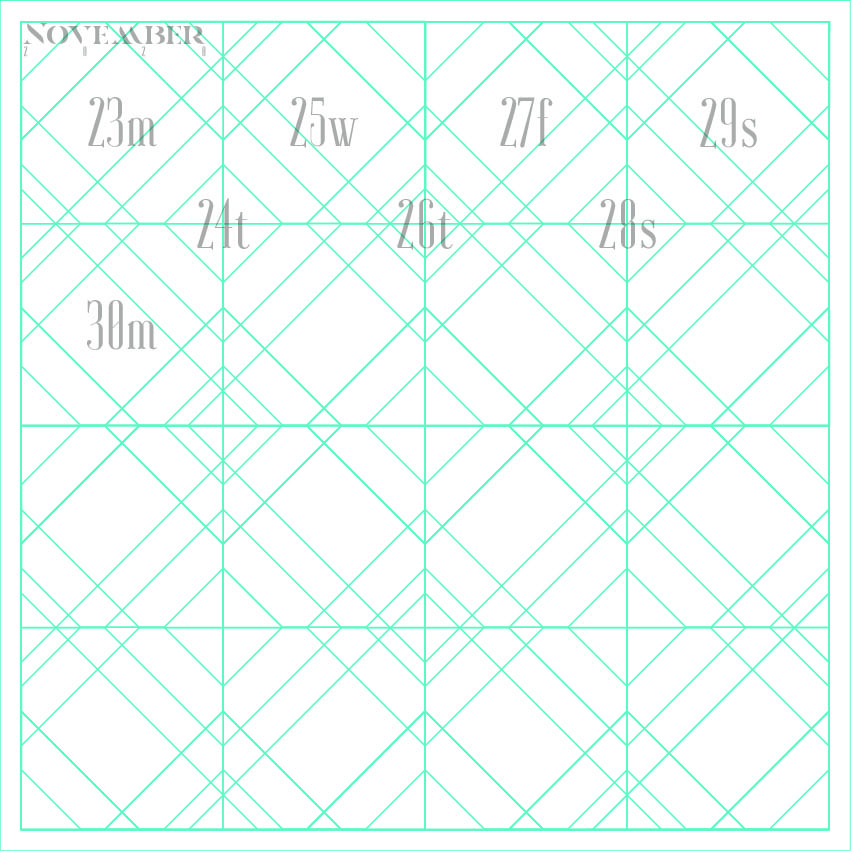
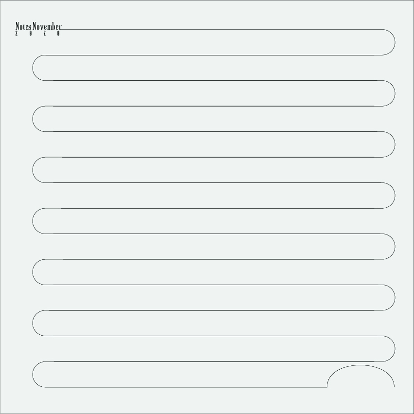
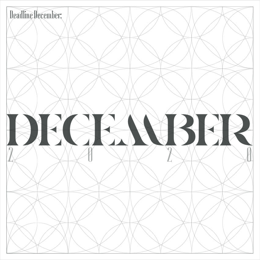
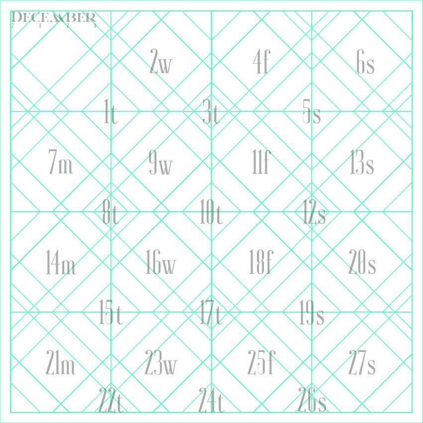
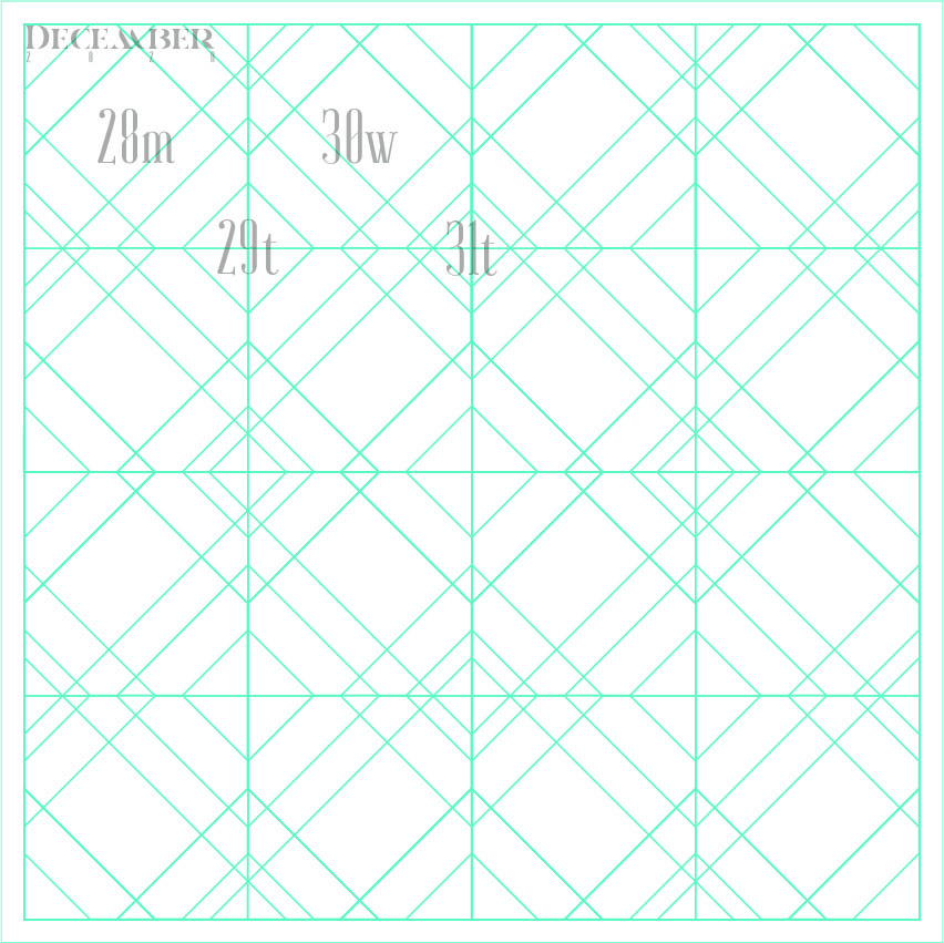
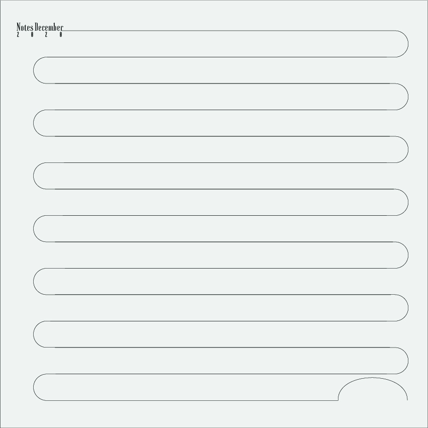
DeCALENDAREditorial & calendar design

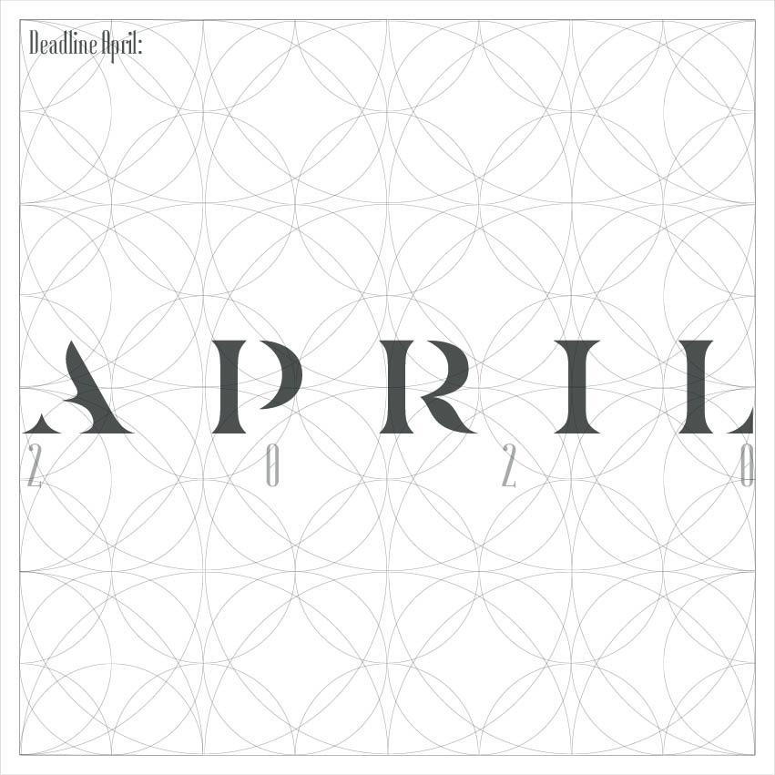
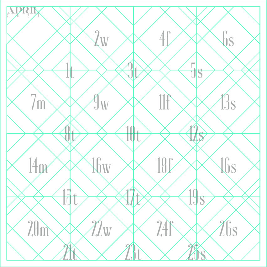
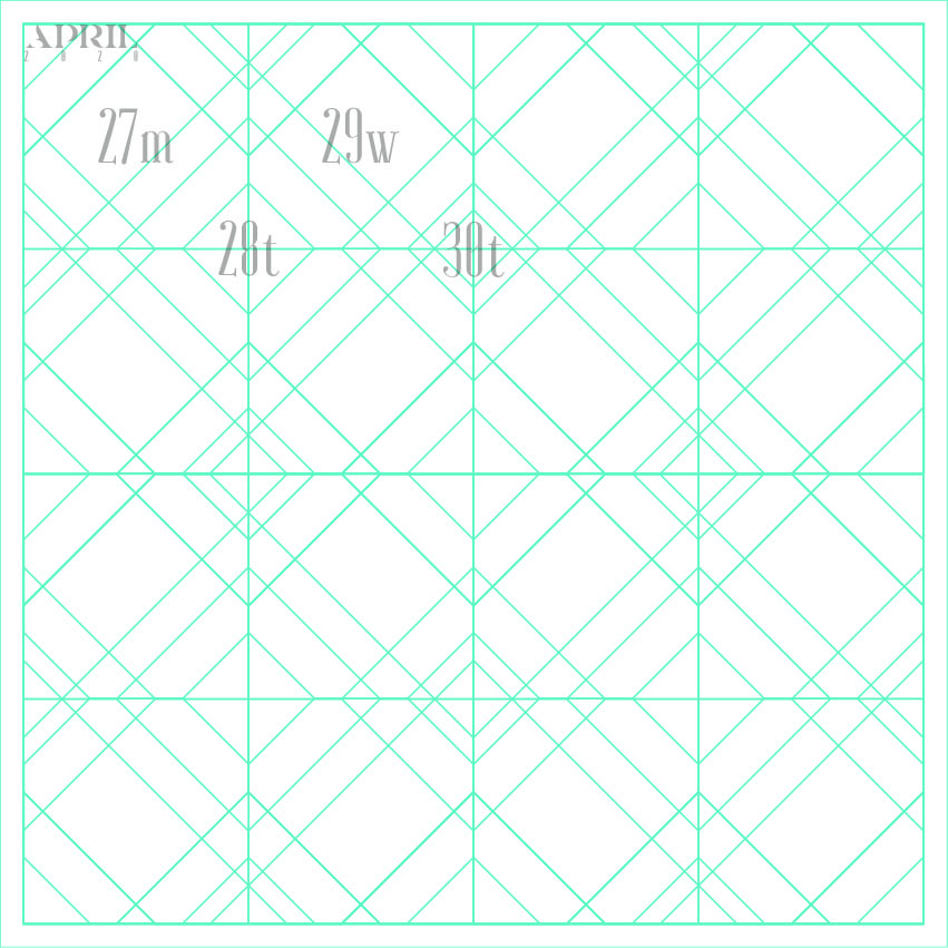
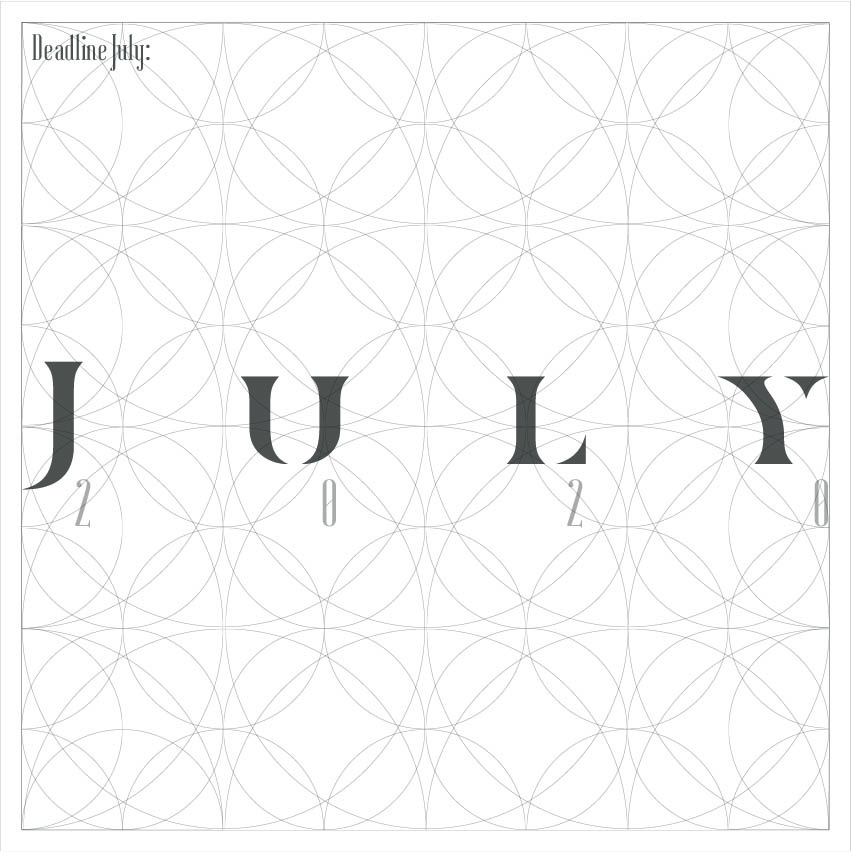
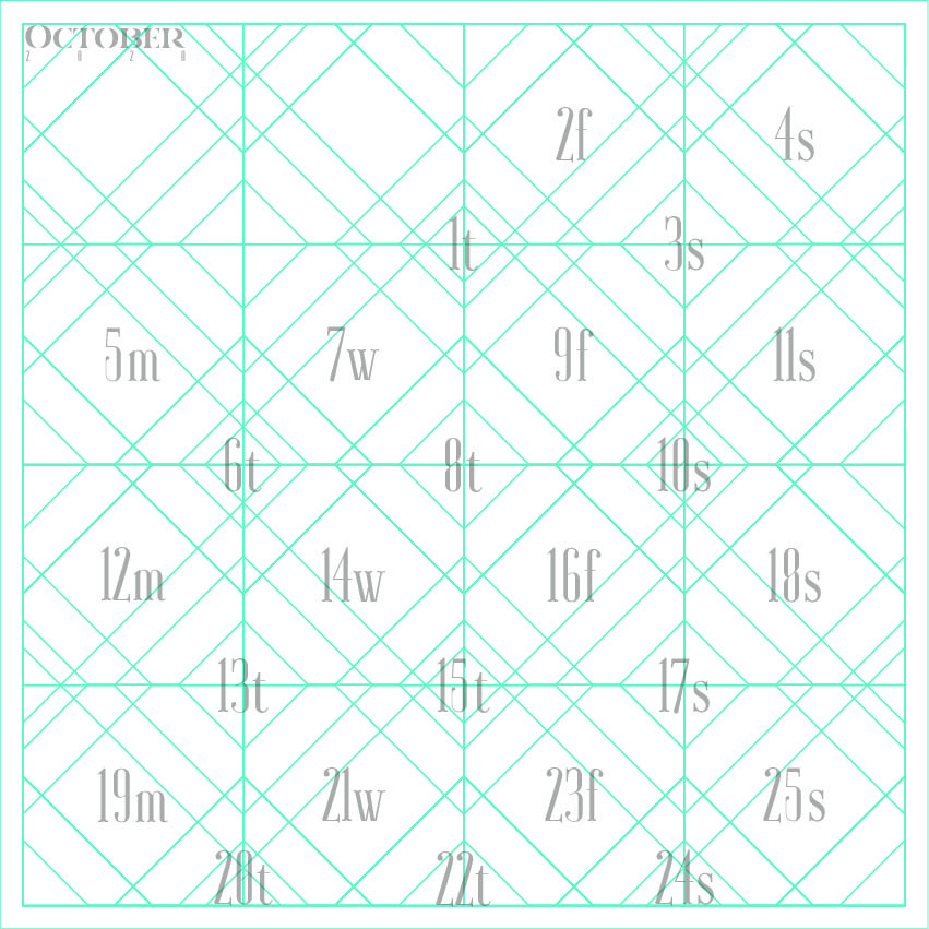
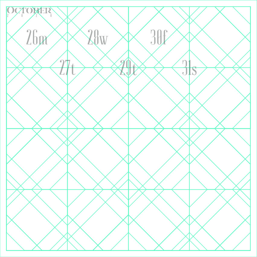
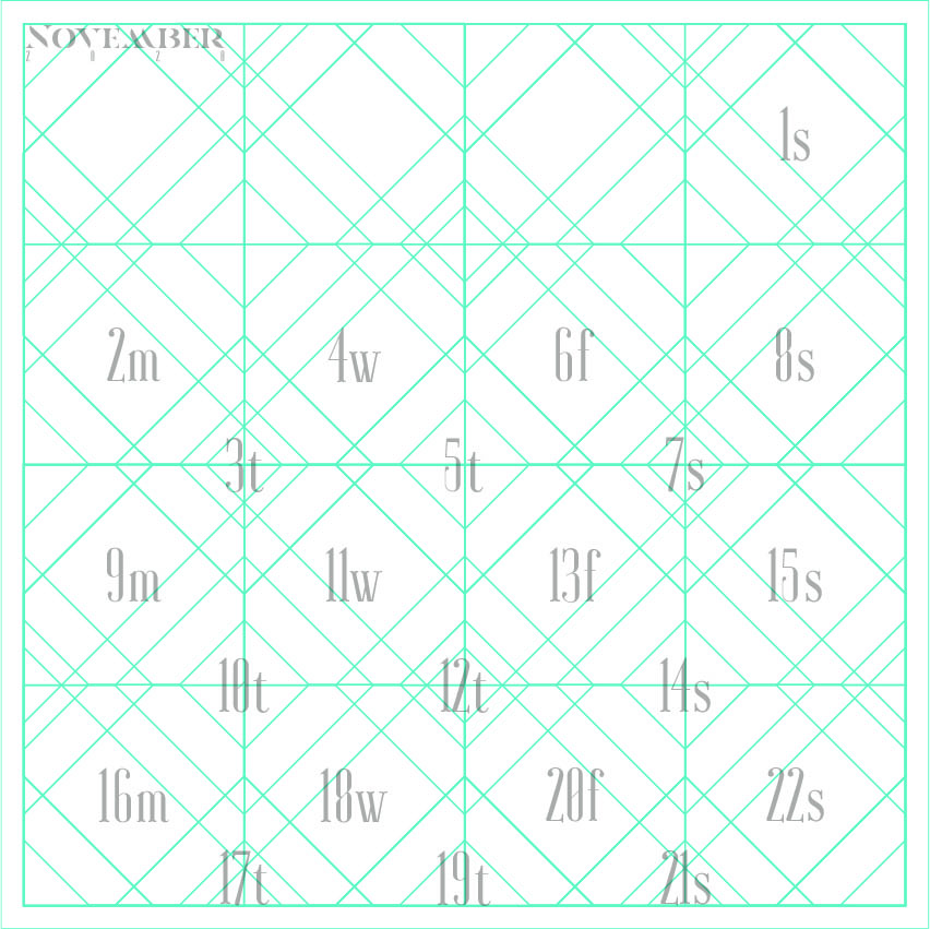
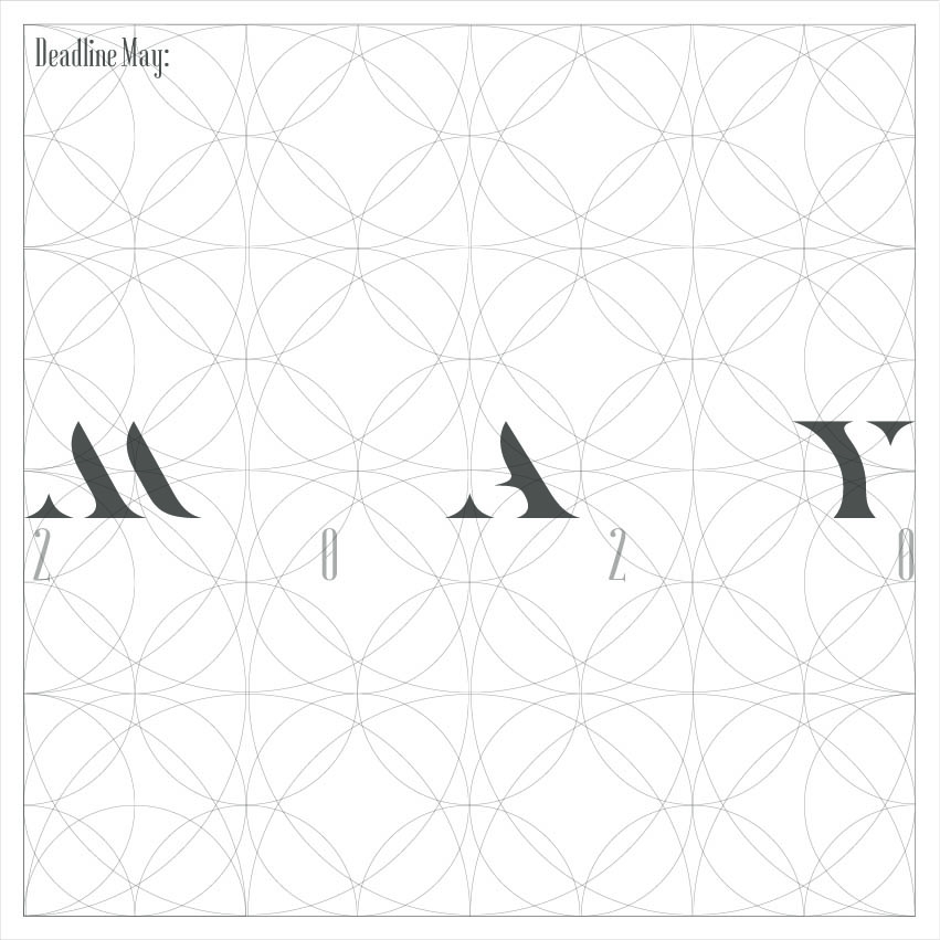
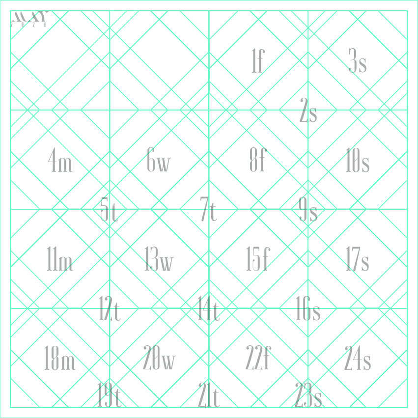
A calendar design project for graphic designers and other creatives. Daily organisation becomes part of a typographic system that connects every page of the publication.

Explore the visual presentation
NG 11 C / DeCALENDARDESIGN BY NILLY GRAPHICS
DeCALENDAR — Editorial & calendar design
DISCIPLINE
Editorial & calendar design
DESIGN
Sotiris Christos / Nilly Graphics
PRESENTATION
85 project images

01 / DESIGN DIRECTION

Time as a typographic composition

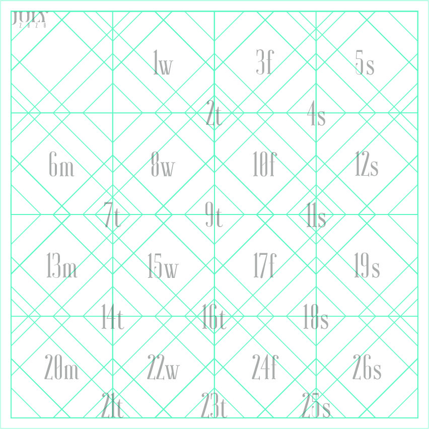
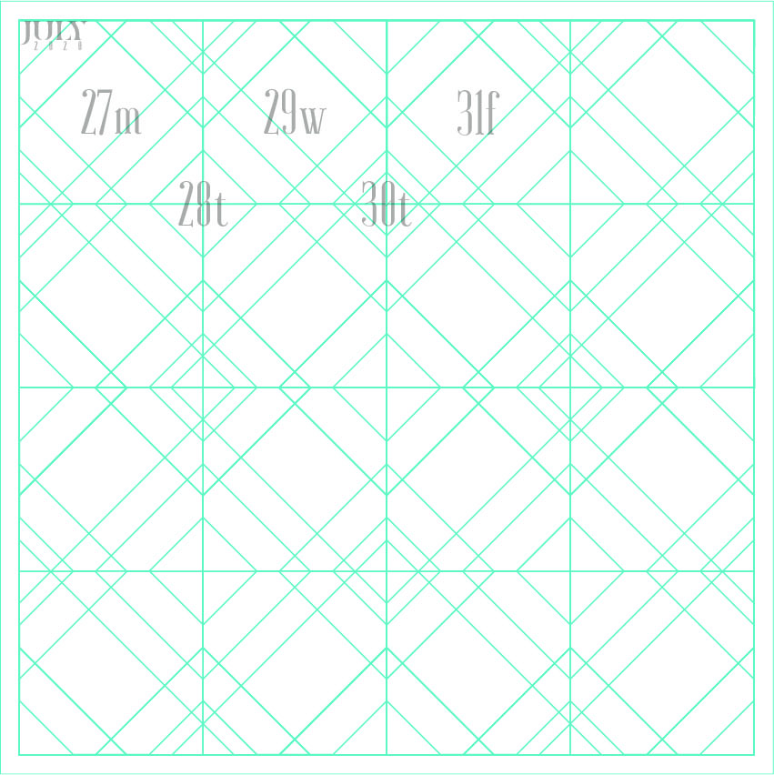
Dates, information and open space follow a clear hierarchy. Typography leads the cover and organises the relationship between labels and page fields.

02 / VISUAL LANGUAGE

Space for creative work

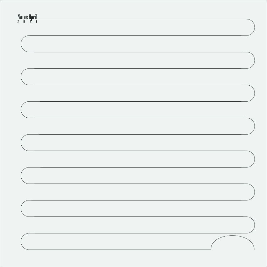
Planning pages are combined with notes, lists and space for sketches. References to deadlines, feedback and brainstorming connect the calendar with creative practice.

Explore the complete collection78 more images

03 / APPLICATIONS

A complete editorial system

The collection presents the cover and interior pages, showing how typography, layout and a consistent visual language work across an extensive publication.

YOUR NEXT PROJECT

The next idea
deserves character.

NEXT PROJECT / NG 12 CD&G LTDBrand identity & web design